

To choose wall art for your home, start with the room, the scale and the feeling you want. Then compare colour, format and framing. This visual guide helps you make those decisions in order, with worked measurements and a checklist you can use before buying.
YOUR FIVE-STEP ROUTE
- Purpose choose the job the artwork should do.
- Scale measure the finished piece and the space around it.
- Colour make one clear connection to the room.
- Presentation compare the whole finished object.
- Check test the outline before you order.
Room choices · Visual sizing tool · Colour approaches · Formats · Buying checklist
Start with a room brief, not an empty wall
Look from the doorway and from where you normally sit. Is the room already led by a fireplace, a window or patterned furniture? Art can support an existing focal point or create a new one. A useful brief might be: “a warm, personal focal point above the sideboard”. That is easier to shop for than “something for this wall”.
LIVING ROOM
Connect to the furniture
Judge the artwork from the sofa and the entrance. A long wall may suit a single horizontal work or a group treated as one composition.
BEDROOM
Choose your own sense of calm
Compare with the headboard and the view from bed. A familiar landscape may feel quieter to you than an abstract in a supposedly calming colour.
DINING & WORK SPACES
Check the everyday view
Review art at seated height. Allow for doors, shelving, screens and the way people move through the space.
Choose a mood in everyday language: quiet, playful, graphic, earthy or energetic. These describe your preference, not a universal psychological effect. Keep the fixed parts of the room—flooring, furniture and curtains—in mind when narrowing your shortlist.
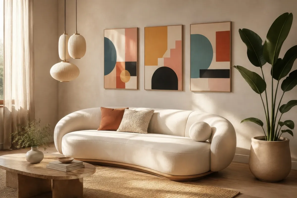
Make the numbers visible
Measure the complete outer artwork, including its frame and mount. For a group, include every gap. Above furniture, 60–75% of its width is a useful starting range to test—not a rule that every room must follow. Snapfish uses this flexible guideline in its canvas advice.
TRY A PROPORTION
One sofa. A useful starting range.
Change the furniture width to see a 60–75% artwork range. This is a visual trial, not a product-size recommendation.
Solid shape: 60% Dashed edge: 75%
Enter a furniture width between 30 and 600 cm, or the equivalent in inches.
The artwork range includes frames and gaps. Height, nearby features and your viewing distance still matter. Without JavaScript, the worked 200 cm example remains visible.
Worked example: a 200 cm sofa
| Calculation | Centimetres | Approx. inches |
|---|---|---|
| Furniture width | 200 cm | 78.7 in |
| Lower trial: 200 × 0.60 | 120 cm | 47.2 in |
| Upper trial: 200 × 0.75 | 150 cm | 59.1 in |
| Two 65 cm outer frames + a 10 cm gap | 65 + 10 + 65 = 140 cm | 25.6 + 3.9 + 25.6 = 55.1 in |
65 cm frame + 10 cm gap + 65 cm frame
140 cm overall · 70% of a 200 cm sofa
The wall sees the complete arrangement. The gap is part of its width.
The inch values are rounded independently, so use the original centimetre values for the calculation. Convert centimetres to inches by dividing by 2.54, or inches to centimetres by multiplying by 2.54. These examples explain proportion; they do not claim that every size is in the catalogue.
MEASURE THIS
Outer frame
The printed image, paper sheet, mount opening and finished frame can all have different dimensions.
ALLOW FOR THIS
Clearance
Record usable wall space, switches, lights, trim, radiators and doors—not only the total wall width.
TEST THIS
A full-size paper outline
Compare at least two sizes from your normal viewing position. Check the wall finish before applying tape.
A tall portrait and a wide landscape can have similar areas but feel very different. Use the available wall height as well as the furniture width. A deliberately small work or an unusual room may need a proportion outside this starting range.
Curated for this story
Shop the look
Considered artwork selected to complement the mood, palette and story.
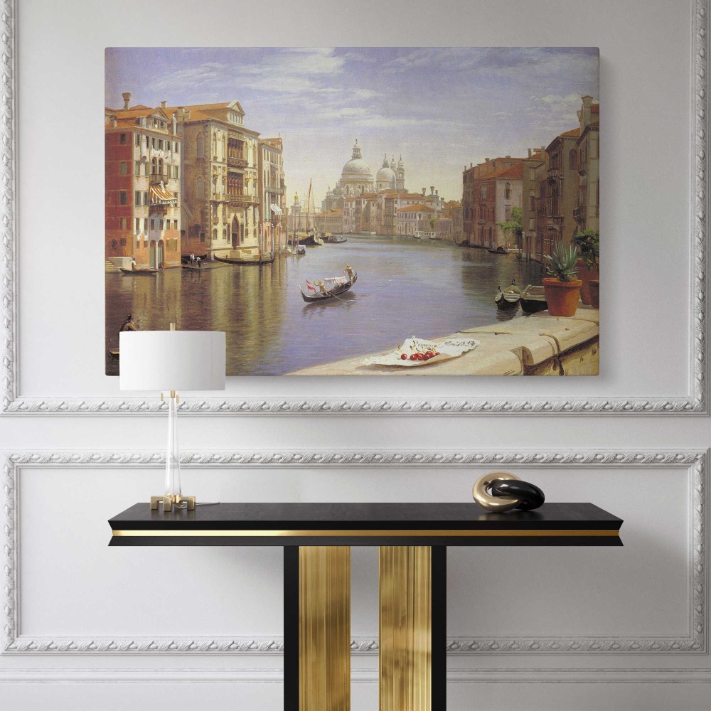
Grand Canal border, Venice scene illustration

Marilyn in Black Corset Dress - Milton Greene 1956 Portrait Canvas Print

Marilyn Monroe Close-Up Portrait - Red Lips and Earrings Vintage Wall Canvas

Marilyn in Red Dress and Feathers - Classic 1950s Glam Look
Three ways to connect art and colour
You do not need to match every colour. One repeated shade, shape or material can make the artwork feel connected. Decide which of these approaches serves the room:
01 / ECHO
Repeat one colour
Pick up a muted green cushion, warm timber or a dark lamp finish. Let the other colours in the artwork have some freedom.
02 / CONTRAST
Create a focal point
Compare a light wall with a darker or more saturated image. Give stronger artwork a quieter frame if both compete.
03 / LEAD
Build from the artwork
Start with a work you love, then borrow one accent for a cushion or small accessory. You do not need to redecorate everything.
View the shortlist in daylight and under the evening lighting you normally use. A screen is not a colour proof: display settings, lighting and print surfaces change the result. Ask about available samples when an exact match matters. Colour examples describe styling choices, not guaranteed effects on mood.
The house style is a starting point
Period home + contemporary art: a clear contrast with decorative mouldings can work well.
Modern home + botanical art: detailed imagery can introduce a softer visual element.
The useful connection: repeat a frame finish or material so the contrast feels considered.
Compare what you will actually receive
CANVAS
Check depth and edges
Confirm the finished depth, edge treatment and whether the composition wraps around the sides. An outer frame changes the presentation.
PAPER PRINT
Check image and sheet sizes
Find the paper size and printed area. A separate mount or frame may increase both the final dimensions and your budget.
FRAMED
Check the complete object
Confirm outer dimensions, finish, glazing and what is included. Consider reflections from nearby windows.
Try a light, dark and timber-toned frame where available. A wider frame adds visual weight. If you own several works already, a repeated finish or similar spacing can connect the group without replacing every frame. Product names do not confirm whether mounts, glazing or hanging hardware are included; the current listing does.
One work or a group?
| Arrangement | Useful when… | Remember |
|---|---|---|
| One statement work | You want a clear focal point and fewer layout decisions. | Compare its width and height with the furniture and nearby features. |
| A pair or triptych | Several pieces create the overall shape you need. | Include the outer frames and gaps in the total width. |
| Gallery arrangement | You want to combine personal subjects or several formats. | Lay it out on the floor, then test full-size paper templates. |
IKEA explains the paper-template method for planning a group. A successful layout does not determine safe hanging hardware: use fixings suitable for the wall and the finished artwork weight.
Before you order: six checks
01
Dimensions
Confirm units, orientation and complete outer size.
02
Composition
Inspect the exact crop, border and canvas edge for the chosen format.
03
What is included
Confirm the frame, mount, glazing and hanging information.
04
Placement
Consider glare, direct sunlight, moisture and usable clearance.
05
Total budget
Allow for framing, delivery and appropriate installation.
06
Destination terms
Read current delivery and returns, especially for custom orders.
Browse Canvas Wall Prints with those measurements to hand. For visual inspiration, explore our introduction to Cubism or Van Gogh’s colour and composition. Check product availability, formats and destination terms on the current listing.
Three quick answers
MATCHING
Does it have to match the sofa?
No. One shared colour, shape or material can connect the artwork. Deliberate contrast is another valid choice.
SMALL ROOMS
Can a large print work?
Yes, when the usable wall area and viewing distance support it. Test the complete outline before ordering.
STARTING POINT
Art first or decorating first?
Either. A favourite work can lead the room, or fixed furniture can narrow the shortlist. Start with the choices hardest to change.
Sources and approach: original editorial examples and proportion calculations by Canvas Wall Prints. Snapfish supports the flexible starting range; IKEA supports the template-planning method. Sources checked 11 October 2026. The interior is an AI-generated Rawpixel interior by Nunny, used under its linked business licence. No customer installation, product test or expert qualification is claimed.