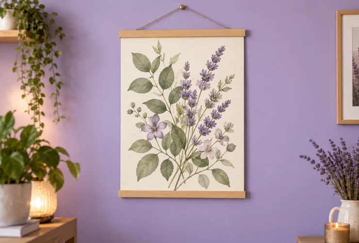

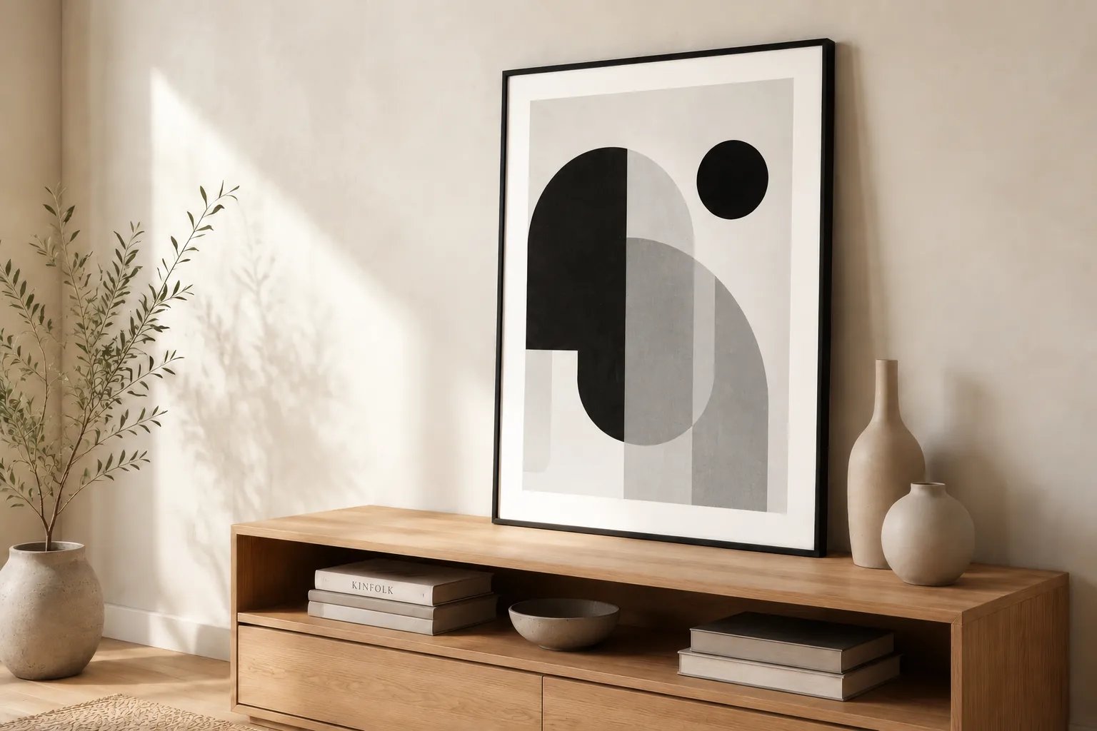
Choose black and white wall art by comparing the balance of light and dark, the subject and the complete frame against your room. A pale drawing, a misty photograph and a bold black abstract can create very different focal points even though they share a limited palette. Start with the furniture and wall you are keeping, then decide whether the artwork should blend gently or stand out clearly.
Illustrative room scene for styling inspiration.
MAKE FIVE USEFUL COMPARISONS
- Contrast compare the light and dark areas.
- Subject choose something you enjoy seeing.
- Room connect with existing finishes.
- Frame compare the whole object.
- Light check your usual viewing conditions.
Compare contrast · Choose subjects · Frames and mounts · Room combinations · Buying checklist
Look beyond the label: compare the balance of light and dark
Some black-and-white images contain mostly pale grey, while others place large black shapes against a light background. Compare these qualities before choosing a subject. Getty’s art vocabulary describes value as how light or dark a colour is, and identifies contrast as one way to emphasise a focal point. Here, that gives you a practical question: how strongly do you want the image to register from across your room?
PALE AND OPEN
Try a quieter visual connection
A drawing with plenty of light space or a pale photograph can sit gently beside textured fabrics. Check that its fine detail is still visible at your normal viewing distance.
MID-TONE AND LAYERED
Compare the range of greys
A photograph with several greys may offer detail without large blocks of black. Look at where its darkest areas sit; the small preview alone can hide an important shadow or focal point.
BOLD AND GRAPHIC
Give a strong shape room to read
A black shape or crisp architectural image can make a clear focal point. Compare it with any dark furniture, busy rug or patterned wallpaper so several features do not compete equally.
A mostly light print does not automatically make a room bigger, and a dark image does not automatically make it gloomy. Those promises overlook the wall, furniture, lighting and personal preference. Use the examples to shortlist a visual direction, then compare the actual image in the place you want it to occupy.
Choose the subject before building a matching set
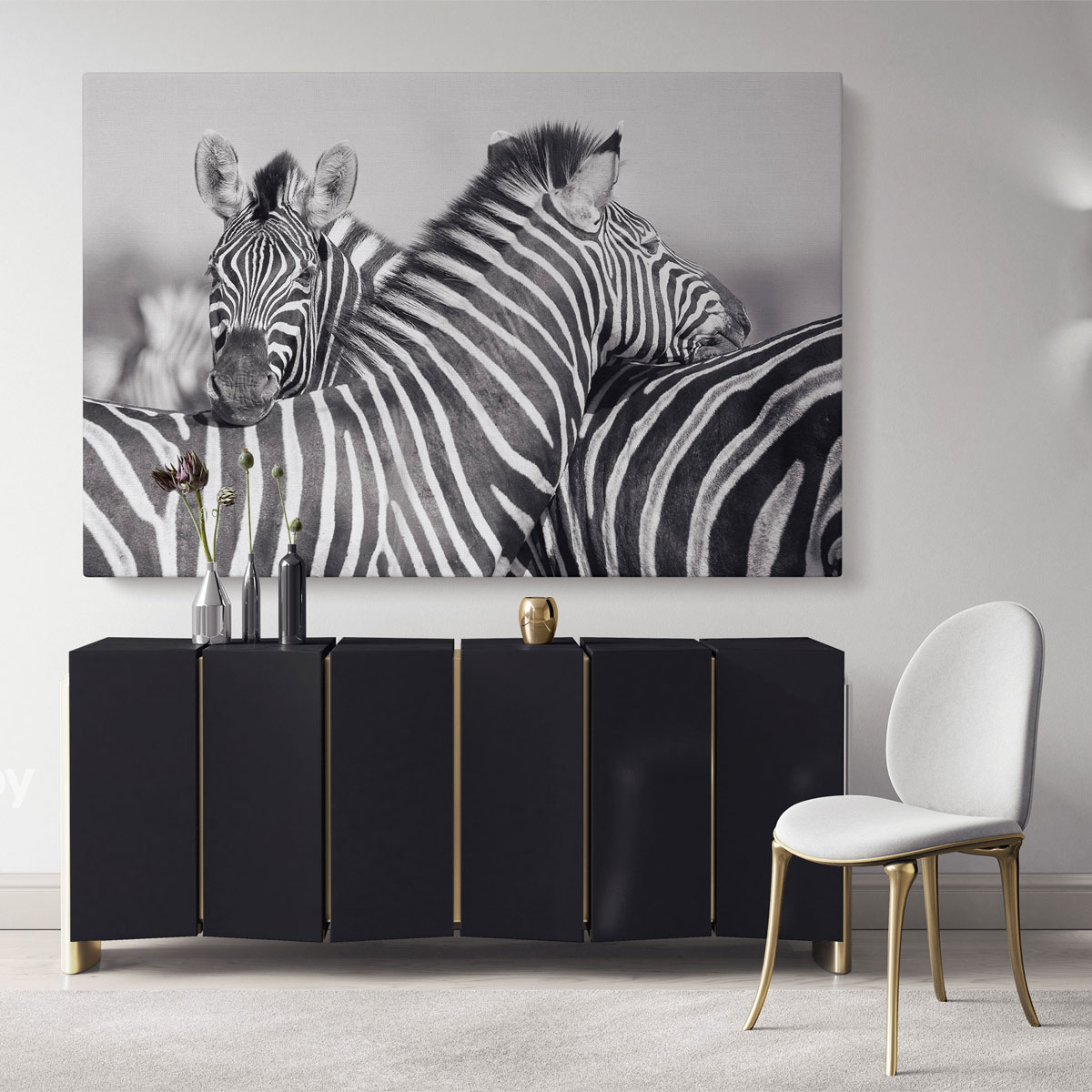
A limited palette can connect very different subjects, but the subject still matters. Choose an image you would enjoy independently of the room trend. A city photograph might refer to somewhere you know; an animal portrait may be the main focal point; an abstract can connect shapes without illustrating a particular place. There is no need for every black-and-white picture to be minimalist.
| Artwork direction | Look for | Compare in the room |
|---|---|---|
| Photography and architecture | Light, shadow, perspective and a subject that means something to you. | Strong building lines can relate to joinery or furniture; check whether small details read across the room. |
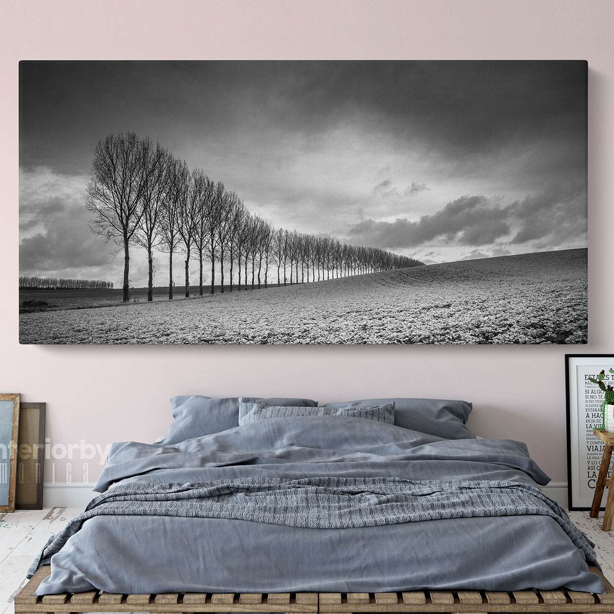
| Landscape or panoramic scenery | A horizon, texture or open area you enjoy. | Compare the image’s horizontal shape with the available wall; a panorama is not automatically the correct size. |
| Animal or figurative image | A clear pose, expression or silhouette. | Consider whether you want a face or figure to draw attention from the main seating position. |
| Abstract or line-led art | Shape, spacing and the placement of dark marks. | Compare curves with softer furniture or straight lines with room structure; either can also provide a deliberate contrast. |
For a pair, look for a shared relationship such as similar tonal weight, frame finish or subject treatment. Two pictures do not need identical compositions. If one image contains a large black area and the other is mostly white, compare the pair together before assuming the frames alone will make them feel balanced. A larger mixed group can use that variation deliberately, but it benefits from a planned layout.
Our black and white wall art collection provides the broader shopping selection. If you specifically want non-figurative designs, compare the separate black and white abstract prints selection. These are different browsing routes; inspect each live product rather than assuming every format or framing option is shared.
Curated for this story
Shop the look
Considered artwork selected to complement the mood, palette and story.
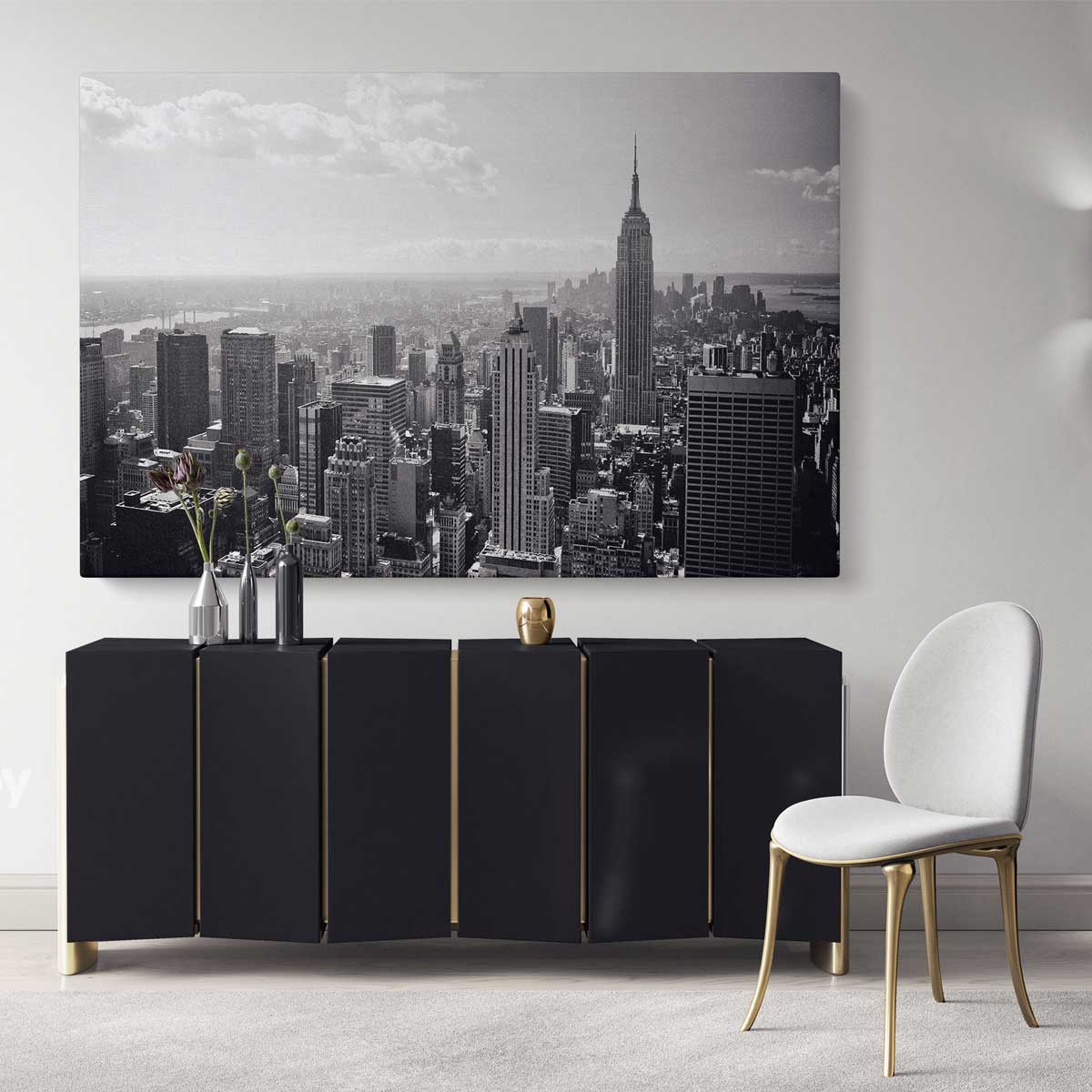
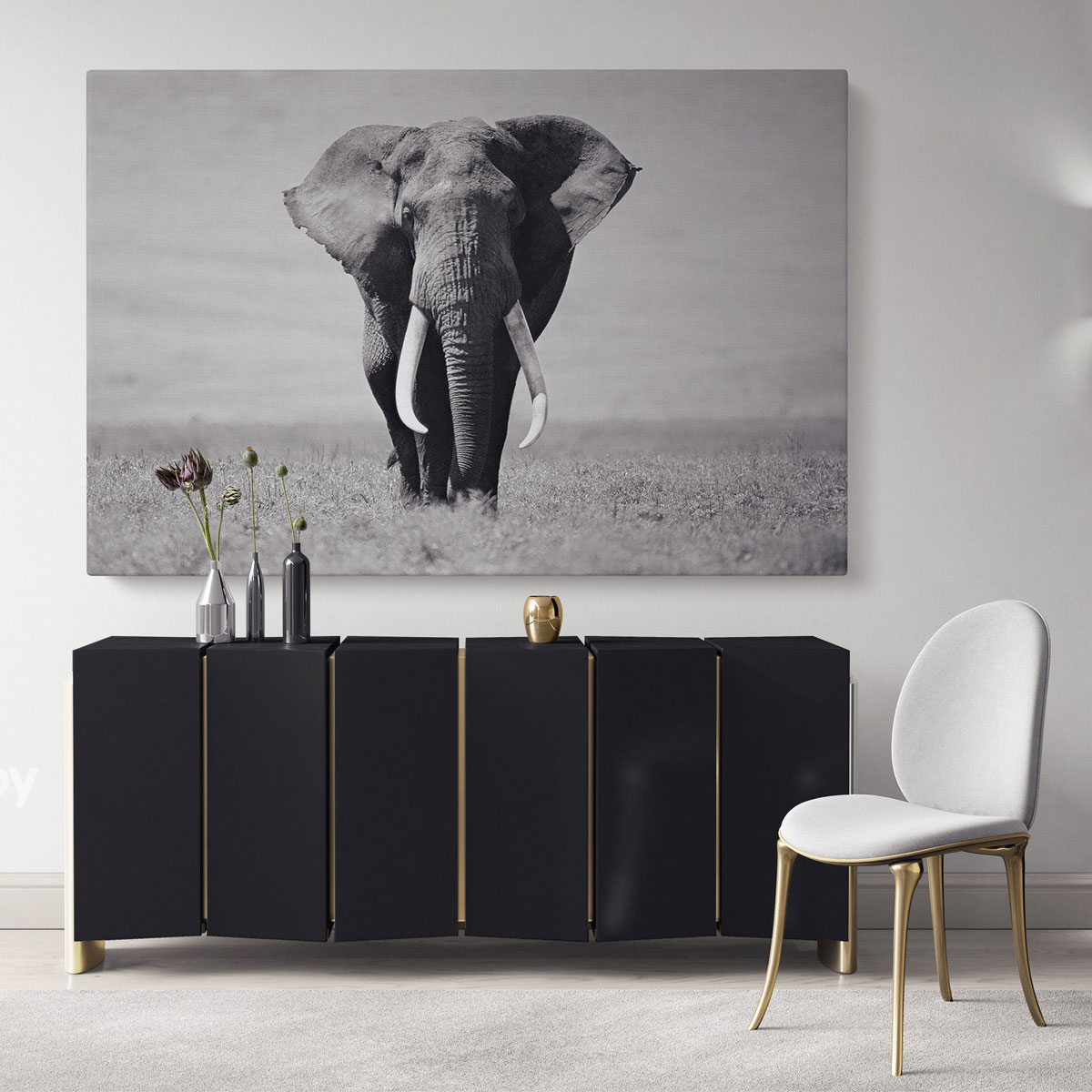
Treat the frame, border and mount as part of the artwork
A slim black frame can create a defined edge. A pale frame can make that edge less pronounced on a light wall. Natural timber can connect a monochrome image with wood furniture. These are styling options to compare, not rules about which frame belongs to each art style. Look at the complete product against your wall colour and the furniture beneath it.
BLACK FRAME
Compare a deliberate outline
Try it when you want a defined edge or a connection with dark furniture details. On a very dark wall, inspect whether the frame remains distinct from the wall and image.
PALE FRAME
Compare the light border
Try it beside a light wall or when you want the image rather than the edge to lead. Different whites can look different together, so compare the frame, paper border and wall finish.
TIMBER FRAME
Connect with existing materials
Compare the wood colour with your furniture or flooring. They need not be identical, but look at them together rather than assuming any timber will make the same connection.
In UK framing, a window mount is the board surrounding the visible image inside a frame; US product descriptions often call it a mat. It is different from a white border printed as part of an image. Both change the appearance, but only the actual supplied specification tells you what is included. Check the full outer dimensions, image area and whether glazing is supplied before ordering.
A hypothetical 40 × 50 cm image is about 15.7 × 19.7 inches, but those image dimensions alone do not tell you the size of a finished frame. Do not use them as a fixing template without the outer measurements. For the complete measuring process, use our visual guide to choosing art for your home.
Build the room around a useful connection, not an all-grey formula
Black-and-white art can sit in a colourful room as well as a neutral one. Start with an existing finish you intend to keep: timber, a sofa fabric, curtains or painted cabinetry. Then choose whether the image should repeat an existing dark detail, introduce a lighter area or offer a different shape. You do not need to replace every warm material with grey.
| Room starting point | A combination to test | Artwork check |
|---|---|---|
| Warm wood, cream and linen | A pale image with a slim black or timber frame. | Compare the paper or image background with the warm wall; white is not a single universal shade. |
| Dark sofa and pale wall | A mid-grey photograph or a bold image with enough light space. | Decide whether the dark areas connect with the sofa or make the wall feel too visually heavy for your preference. |
| Colourful upholstery | A limited-palette photograph, drawing or abstract with a deliberate frame. | Keep the subject meaningful; removing colour from the art does not remove all visual activity. |
| Patterned wallpaper or textiles | A simpler image with fewer competing marks. | Compare the frame edge and image background against the pattern before adding several pictures. |
In a living room, judge the print from the seat and doorway. In a bedroom, compare it with the headboard and bedding rather than buying a design solely because it is described as calming. In a dining space, check the picture under your evening lights and around the pendant; our dining-room wall-art guide explains those sightline checks. These decisions are about fit and preference, not promised effects on sleep or mood.
If you enjoy one coloured accent, a monochrome image can sit beside it without containing that colour. Alternatively, art sold as black and white with a colour accent may include a deliberately coloured detail. Compare the actual image: it belongs to a different visual direction from an entirely greyscale design. Neither is inherently more sophisticated or easier to live with.
Check the real light, format and care instructions
DAYLIGHT
Inspect the image and wall together
Check the chosen wall at different times. A screen preview cannot tell you exactly how every grey, white border or reflective surface will appear in your room.
EVENING
Use your usual lamps
Look from where you normally sit. Check whether dark details remain readable and whether a lamp or window reflection interrupts the image if the selected format has glazing.
PRODUCT DETAILS
Confirm the object you will receive
Check whether you are buying canvas, a paper print or a framed format, and read the selected size, finish, glazing and care details. A styled room mockup does not establish those specifications.
Black-and-white imagery does not make a print immune to its display conditions. The Canadian Conservation Institute’s care guidance for works on paper recommends avoiding sunlight exposure and discusses UV-filtering glazing and the spacing provided by a window mat. That advice concerns paper artworks; it is not a test of our catalogue or a reason to assume every supplied frame has protective glazing. Follow the actual product’s care information, and do not treat UV filtering as permission to display a print in direct sun.
Your black-and-white artwork buying checklist
- Choose the amount and placement of light and dark, not just the black-and-white label.
- Select a subject you enjoy and compare it from your normal viewing distance.
- Judge the image, frame and any mount or printed border as one object.
- Connect the artwork with existing furniture or materials without forcing an all-grey room.
- Check actual outer dimensions and format before ordering or planning fixings.
- Compare daylight, evening lighting and reflections, then follow the product’s care instructions.
Shortlist a pale option, a mid-tone option and a stronger graphic option if you are unsure. Compare each against the same wall and furniture. The most useful choice is the complete arrangement you prefer in the real room, rather than the image that looks most dramatic in a small online thumbnail.
Sources: Getty: vocabulary for describing an artwork; Canadian Conservation Institute: basic care of works on paper. Checked 19 October 2026. Room combinations, diagrams and comparison prompts are original styling examples; screen tones and frame colours are approximate.