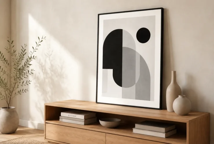

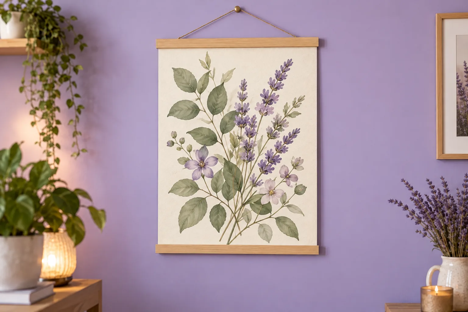
Colours that go with purple include cream, warm grey, sage green, mustard yellow, blush pink and deep blue. The useful pairing depends on which purple you have and how much of it the room contains. Start with the sofa, floor or wall you are keeping, choose one supporting colour, then use artwork to connect the two.
Illustrative room scene for styling inspiration.
BUILD YOUR ROOM PALETTE
- Purple compare its colour direction.
- Anchor keep a lasting room finish.
- Pair choose a supporting colour.
- Artwork connect or contrast.
- Sample check the actual room light.
Identify your purple · Six palettes · Choose artwork · Room examples · Sample checklist
Identify the purple before choosing its partner
“Purple” describes a wide family. A pale lavender wall, a dusty mauve sofa and a deep aubergine cabinet will not create the same starting point. Compare your sample with something you know is blue and something you know is red: does it lean towards either? Also compare its lightness and intensity. A muted purple may be easier to combine with existing finishes than a vivid violet, but neither is automatically the better choice.
PALE LAVENDER / LILAC
Keep the supporting colours considered
Try cream, pale sage or a restrained grey. Test whether the purple looks crisp, pinkish or blueish beside your actual floor and fabrics; colour names alone do not settle the match.
DUSTY MAUVE / PLUM
Work with the existing warmth
Taupe, warm wood and a muted green are useful options to compare. If the purple is already a large upholstered piece, keep the wall sample beside that fabric while choosing.
DEEP AUBERGINE / VIOLET
Decide how much contrast you want
Cream gives a clearer light–dark contrast; darker timber or deep blue can make a more enveloping scheme. Add a lighter artwork background when the image needs to stand out.
Farrow & Ball’s purple colour-scheme guidance includes both neutral and richer jewel-tone combinations, and recommends trying shades in their intended surroundings. The palettes below are our own room-planning ideas. They are not exact matches to a manufacturer’s paint colours or promises about how every room will feel.
Six purple colour combinations to try at home
LAVENDER · CREAM · OAK
Light and soft
Try a cream wall or large rug, lavender upholstery or textiles, and oak furniture. A botanical print with a pale background can connect the purple with green leaves without matching the wall exactly.
PLUM · SAGE · LINEN
Muted botanical
Use sage in curtains or a chair beside a plum accent and linen-coloured walls. Choose art that repeats either the purple or green; it need not include both in equal amounts.
VIOLET · GREY · CHARCOAL
Clear and modern
Compare the grey beside the purple and flooring before buying. Simple abstract shapes or a pale photographic print can give a cleaner focal point when the room already has strong furniture lines.
AUBERGINE · MUSTARD · WALNUT
Rich contrast
Keep mustard in a smaller area such as a cushion, lampshade or detail within the art when you want a restrained result. Walnut or another existing dark timber can provide the supporting connection.
MAUVE · BLUSH · IVORY
Soft and related
Try one colour on the larger surface and the other in textiles. A drawing with plenty of ivory space, or a restrained floral, can stop the room becoming a collection of equally busy pink and purple patterns.
PURPLE · NAVY · STONE
Deep with relief
Compare navy upholstery with a purple wall or accent. A pale rug, curtain or artwork background can provide separation. Check the result under the lighting you use most, especially in a room with limited daylight.
Swatches are approximate screen colours. Compare physical paint samples, fabric and timber in your room; these names are palette descriptions, not product codes. Cream and grey also vary, so check their undertones rather than assuming any neutral will work with any purple.
| If the purple is… | Try this first | Artwork connection |
|---|---|---|
| A large sofa or chair | A neutral wall that suits the flooring | Repeat a small purple detail in a lighter image. |
| A whole wall | A quieter fabric or an existing timber finish | Compare the artwork’s background against the wall. |
| Only in cushions or bedding | A print that includes the purple and a room neutral | Let the art link the small accents without adding purple everywhere. |
| Already paired with a busy pattern | A plain supporting surface | Choose a simpler image or a more limited colour range. |
Curated for this story
Shop the look
Considered artwork selected to complement the mood, palette and story.
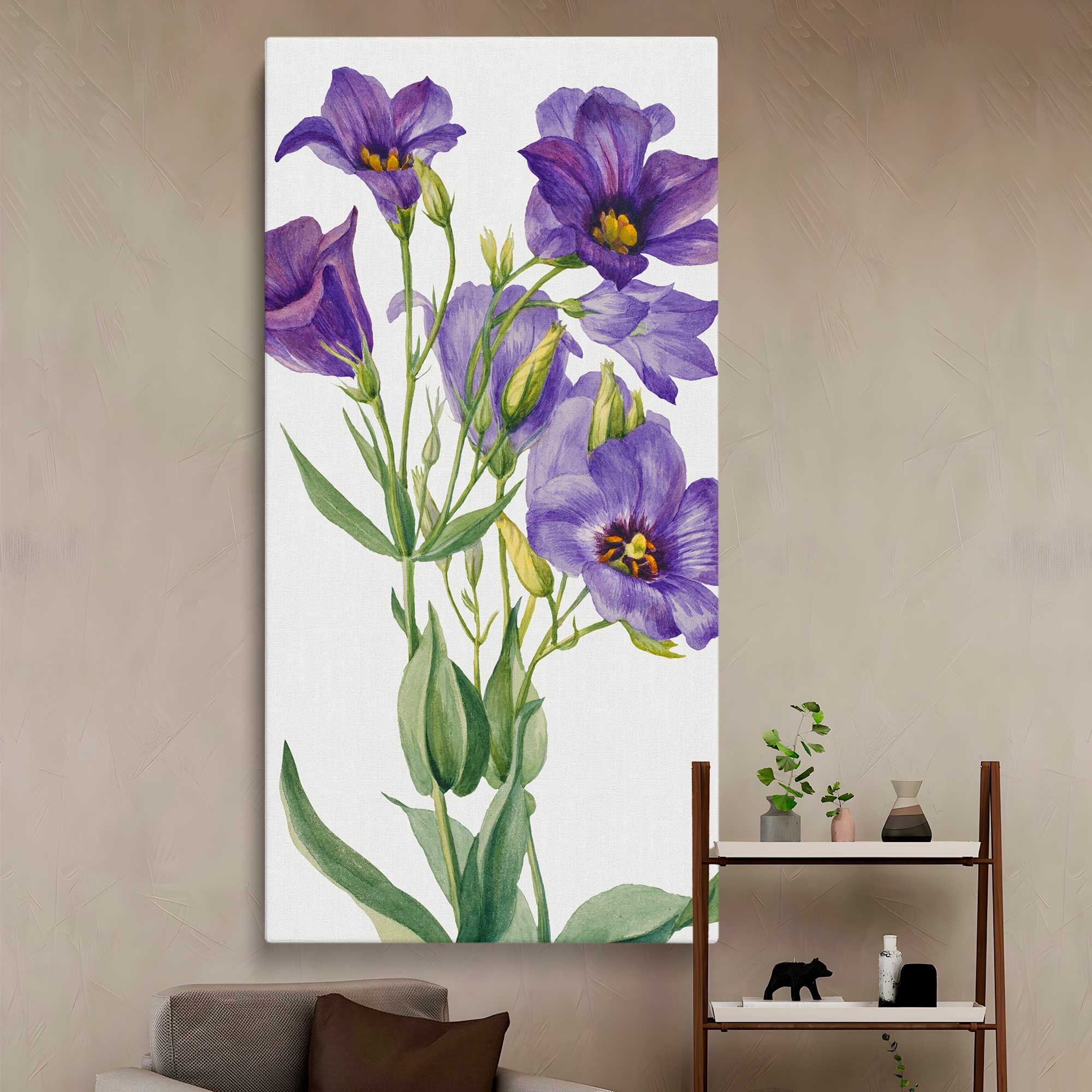
Eustoma russelianum 1930 by Mary Vaux Walcott Canvas Wall Art Print

Violet and Columbine - Rich Green Blue and Coral Floral Design By William Morris
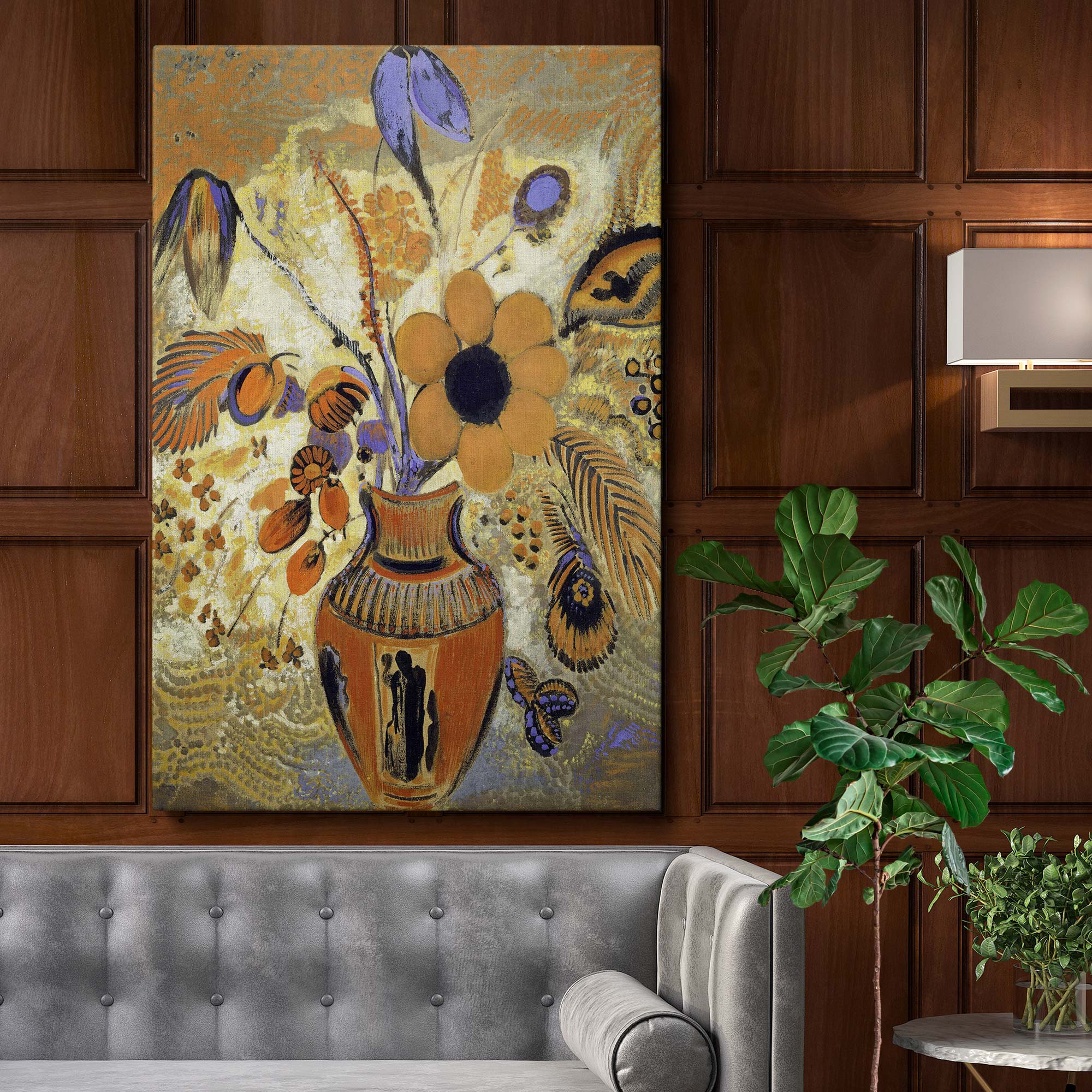
Etruscan Vase with Flowers - Symbolic Floral Still Life By Odilon Redon
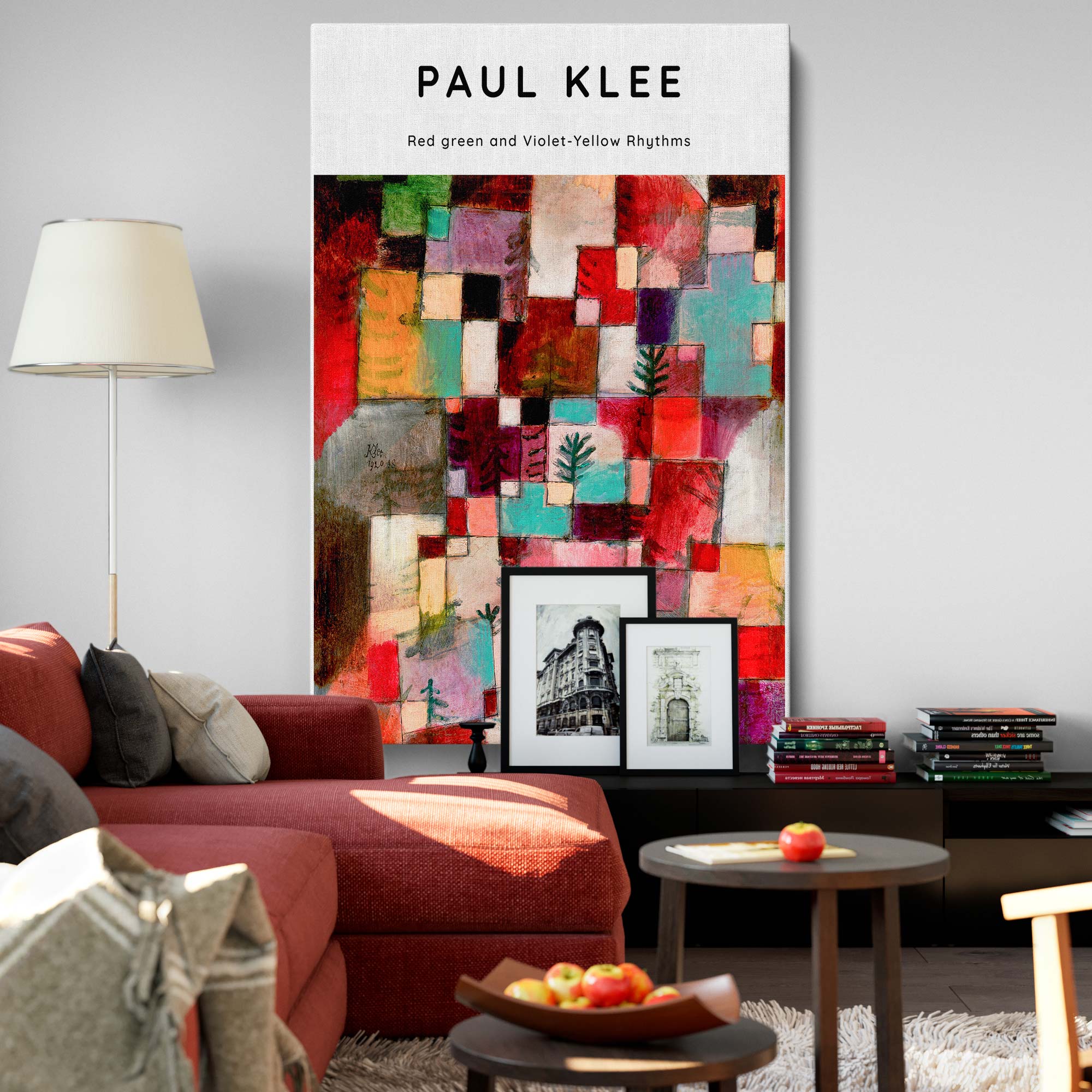
Red, Green, Violet-Yellow Rhythms - Abstract Color Geometry By Paul Klee
Use artwork to connect the palette, not fill every colour
Look at the whole artwork: background, subject, surrounding space and frame. A print with one small mauve flower may connect more comfortably with a purple chair than a mostly purple image. If the walls already provide the colour, a cream-background botanical or a black-and-white photograph gives you another way to create a focal point.
REPEAT
Echo one useful colour
Look for a purple detail plus a neutral that is already present in the room. This creates a connection without requiring the print to imitate the sofa’s exact shade.
BRIDGE
Link two room finishes
A floral or abstract containing purple and green can connect purple textiles with a green chair or plants. Compare the actual print colours; a product name is not enough.
CONTRAST
Separate the image from the wall
On a deep purple wall, compare a pale image background and a visible frame edge. A dark image can still work, but test whether its shapes remain distinct in evening light.
Check the frame against handles, lamps, shelves and other finishes. Warm timber can repeat furniture; a dark frame can echo a metal fitting. Neither choice guarantees a match. If a pattern or image already contains many colours, keep the neighbouring textiles simpler so the artwork has space to lead. For the wider room, scale and buying process, use our guide to choosing art for your home.
Browse the purple wall art collection for images with purple accents, then compare their backgrounds and secondary colours with your samples. A neutral or green artwork can also suit a purple room; the collection is a starting point, not the only possible direction.
Adapt the combination to the room and the house
| Room example | Start with what stays | A palette trial |
|---|---|---|
| Bedroom | Flooring, bed fabric and curtains | Lavender, cream and wood, with a restrained botanical print. Test from the bed as well as the doorway. |
| Living room | The sofa and the largest rug | Plum with sage and linen, or violet with grey. Use one artwork colour to connect the seating and wall. |
| Dining room | The table finish and evening lighting | Aubergine, walnut and a small mustard accent. Check the art under the lights used while eating. |
| Home office | Desk, storage and the view behind your screen | Mauve with ivory and a limited green accent. Place the art where you will enjoy it without creating distracting reflections. |
In a period house, existing joinery, timber and architectural details can guide the supporting palette. You can still choose contemporary art; repeat one room finish or shape to give it a connection. In a modern flat with clean lines, a botanical image can soften the composition while its simple frame relates to the furniture. House style offers clues, not a requirement to buy only one genre of artwork.
If you rent or prefer to keep neutral walls, introduce purple through one upholstered item, a throw or the artwork itself. Try the smallest change first and compare it with the room you already have. If you like a stronger scheme, develop a coordinated set of physical samples before committing to a wall colour and several new fabrics at once.
Test light, materials and contrast before committing
The same colour can appear different beside another material or under different light. Benjamin Moore’s neutral-colour guidance recommends testing from morning to evening under both natural and artificial lighting, and notes that screen and printed representations can differ from actual paint. Apply that sample-first approach to the whole purple palette, including the neutral you intend to use beside it.
DAYLIGHT
Compare the samples together
Put the paint sample beside the upholstery, floor or timber it needs to work with. Look at more than one part of the room rather than judging a small chip in isolation.
EVENING
Use your normal lamps
Check with the lights you actually switch on. Decide whether you still like the purple and whether the artwork’s pale and dark shapes remain clear.
MATERIALS
Include texture and finish
Compare a velvet, a linen and a painted surface as actual materials. Screen swatches cannot show how every fabric or paint finish will look in your room.
| What feels wrong? | A useful adjustment to test |
|---|---|
| Purple and grey look disconnected | Try a different grey undertone or a cream/taupe sample beside the existing floor. |
| Several strong colours compete | Keep one leading colour and reduce the others to smaller areas. Compare a simpler artwork. |
| The art disappears on a dark wall | Test a lighter image background or a clearer frame edge before changing all the room colours. |
| The room looks too closely matched | Introduce a related neutral or another texture instead of buying every item in the same purple. |
Your purple palette checklist
- Identify the purple using the actual paint or fabric, not just its name.
- Choose one lasting room finish as the palette anchor.
- Test one supporting colour before buying a whole scheme.
- Use artwork to repeat, bridge or contrast with the room.
- Compare physical samples in daylight and under your usual evening lights.
- Check the artwork’s full background, frame and finished size before ordering.
Start with one of the six palettes, then adjust it around your own finishes. You do not need equal amounts of every colour, and the art does not need to contain every shade. A small, deliberate connection between the artwork and the room can be enough to make the scheme feel considered.
Sources: Farrow & Ball: purple colour schemes; Benjamin Moore: neutral colours, undertones and sample testing. Checked 14 October 2026. Palettes and diagrams are original styling examples; screen swatches are approximate, not paint specifications.