
Choose kitchen wall art by finding a suitable wall, measuring its clear space and connecting the artwork with one lasting room finish. A fruit still life, a quiet abstract or a personal photograph can all work. The best choice depends on how you cook, where you sit and what the cabinets, tiles and worktops already contribute.
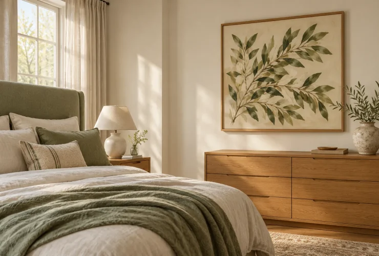
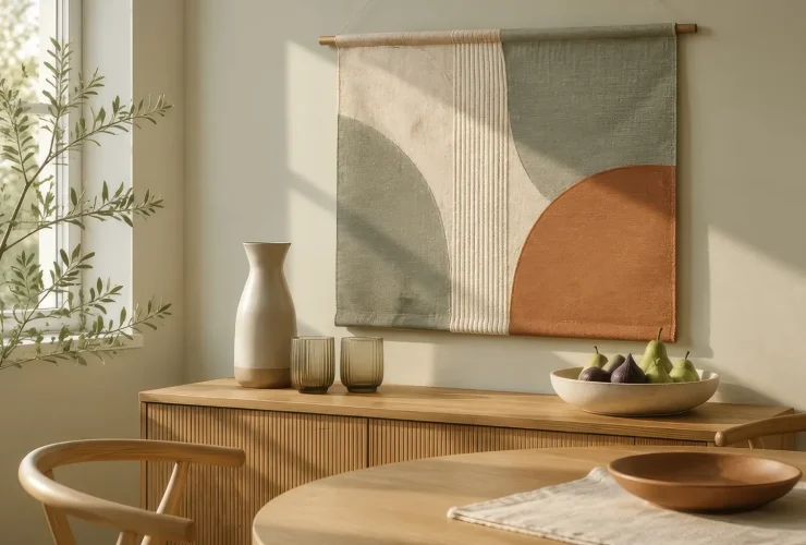
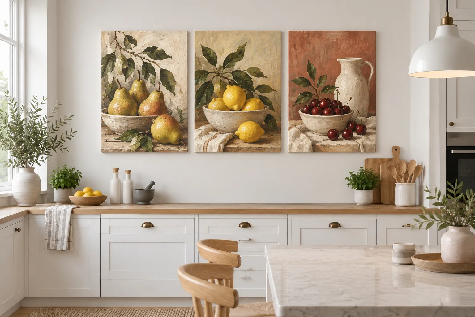
Illustrative room scene for styling inspiration.
YOUR FIVE-STEP ROUTE
- Position observe cooking and washing.
- Space measure the clear wall.
- Subject choose the room’s mood.
- Colour repeat one useful accent.
- Check test size and construction.
Choose the wall · Size examples · Subject and style · Cabinet colours · Buying checklist
Choose a wall that works with everyday cooking
Start with the view from the doorway and the place where you have breakfast. A breakfast nook or a wall beside the dining table can give artwork a natural role without adding clutter to the working part of the kitchen. In an open-plan room, use art to mark the eating area, then check that it also makes sense from the adjoining living space.
EATING AREA
Give the wall a focal point
A clear dining wall is a good candidate to assess. Compare the artwork with the table, pendant light and nearby shelving rather than treating each feature separately.
PREPARATION AREA
Observe the room in use
Check whether water, food splashes, steam or cabinet doors reach the proposed position. A clear wall in a photograph may be busy during meal preparation.
COOKING AREA
Keep ordinary art out of the mess
Avoid positions exposed to hob heat, cooking splashes and greasy deposits. Choose another wall when the conditions or the product’s suitability are uncertain.
| Wall position | What to look for | Planning decision |
|---|---|---|
| Beside a dining table or breakfast nook | A clear view, chair movement and nearby lighting | Test one focal piece or a compact group. |
| Above a sideboard on the kitchen’s quieter side | Objects on the surface and access to sockets | Include the tallest regular objects in your outline test. |
| Near a sink or kettle | Repeated splashes, steam and damp surfaces | Assess normal use; do not assume distance alone protects the art. |
| Above or beside the hob | Heat, cooking oil and food splashes | Choose a different position for ordinary decorative prints. |
The Canadian Conservation Institute’s guidance on paintings advises avoiding food and drink splatters, direct sunlight and unstable environmental conditions; it also identifies cooking oil as a source of surface grime. This is general care guidance, not a test or certification of a particular canvas print. There is no single clearance that makes every kitchen wall suitable.
Size the artwork to the clear wall, not the whole kitchen
Measure the wall that is genuinely available after allowing for cupboards, switches, shelves and door movement. Include the outer frame or canvas edges, not only the printed image. For a group, add every gap. A narrow strip between a tall cabinet and a doorway may suit one portrait piece; a broad dining wall gives you more choices.
| Worked layout trial | Size (cm) | Approx. in |
|---|---|---|
| One outer piece | 40 × 60 cm | 15.7 × 23.6 in |
| Two 30 cm outer pieces with an 8 cm gap | 30 + 8 + 30 = 68 cm wide | 26.8 in overall |
| Clear wall width | 100 cm | 39.4 in |
| Space left around that pair | 100 − 68 = 32 cm total | 12.6 in total |
| If centred: space on each side | 32 ÷ 2 = 16 cm | 6.3 in per side |
30 cm piece + 8 cm gap + 30 cm piece
68 cm overall about 26.8 in
On a 100 cm clear wall, a centred pair leaves 16 cm on each side. These are example outer dimensions, not a required margin or a promised catalogue size.
Convert the completed centimetre measurement to inches by dividing by 2.54, then round; adding already rounded inch values can change the last decimal. Make paper outlines of the finished pieces and compare them from the doorway and your usual seat. Open nearby cupboard doors during the test. Check that frames do not compete with a pendant or disappear behind countertop objects.
For large kitchen wall art, test one larger outline before committing to several small prints. One clear image can simplify a wall already surrounded by cabinets and accessories. A pair is useful when you want a repeated subject or colour, but its combined width matters more than the size of either print. Our guide to choosing art for your home covers the broader room, size and buying decisions.
Curated for this story
Shop the look
Considered artwork selected to complement the mood, palette and story.
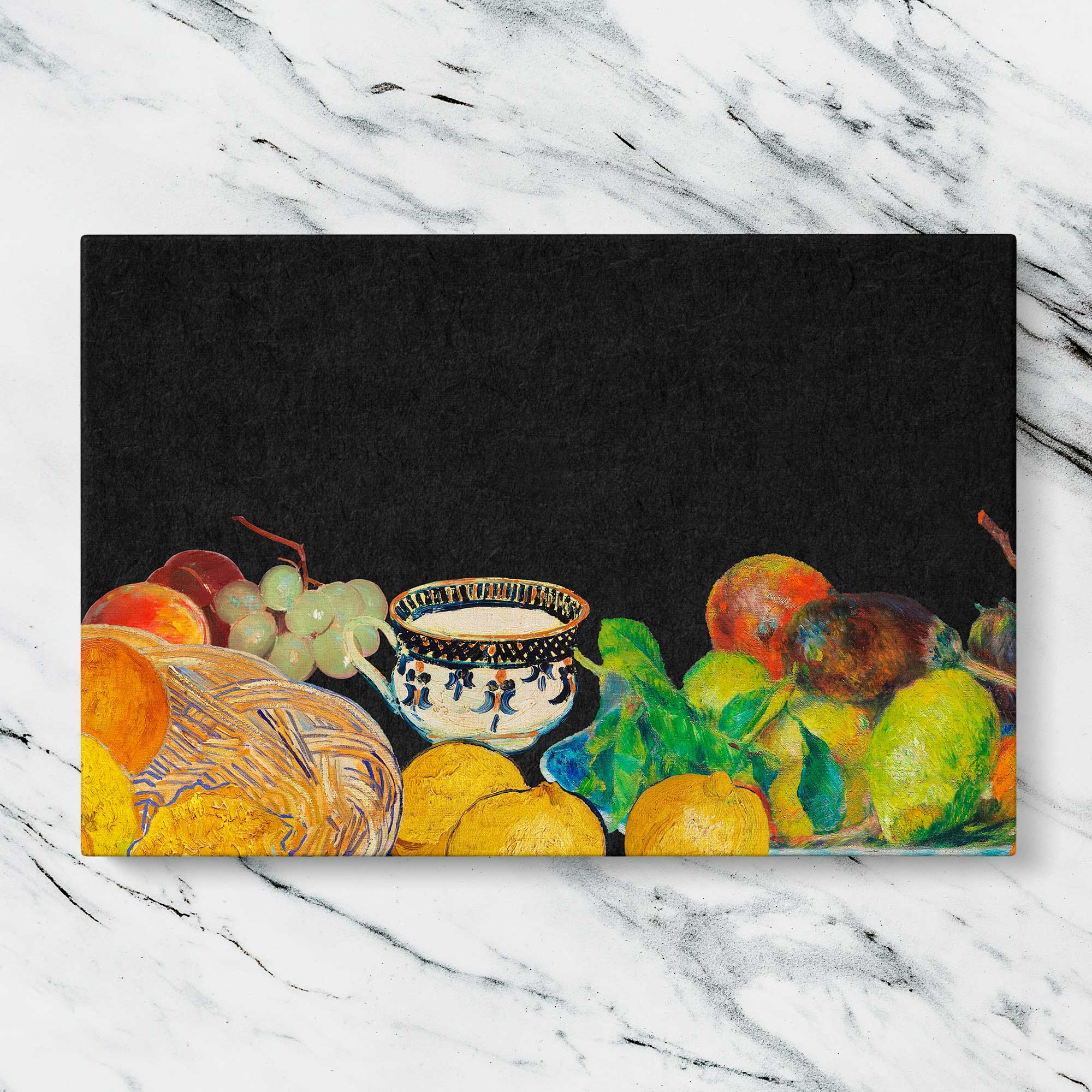
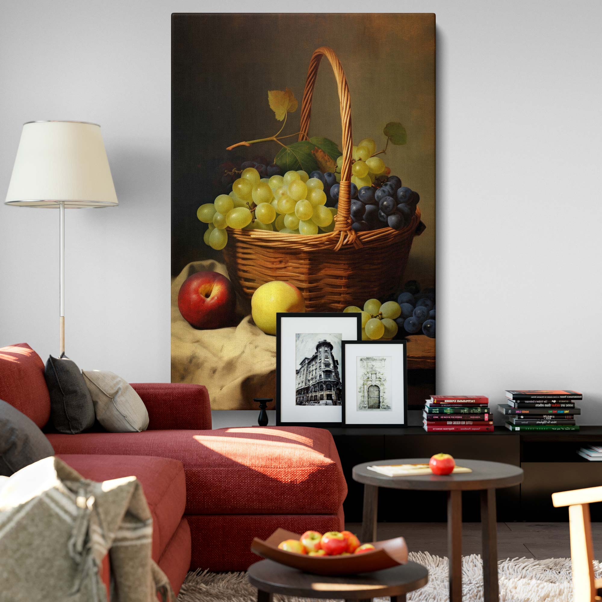
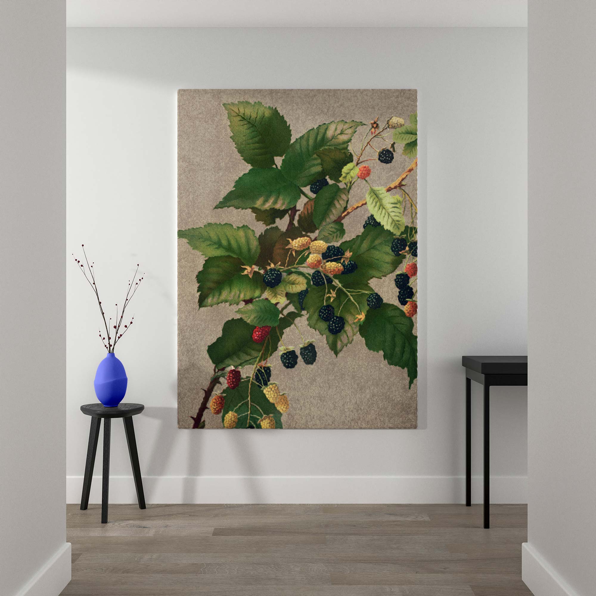
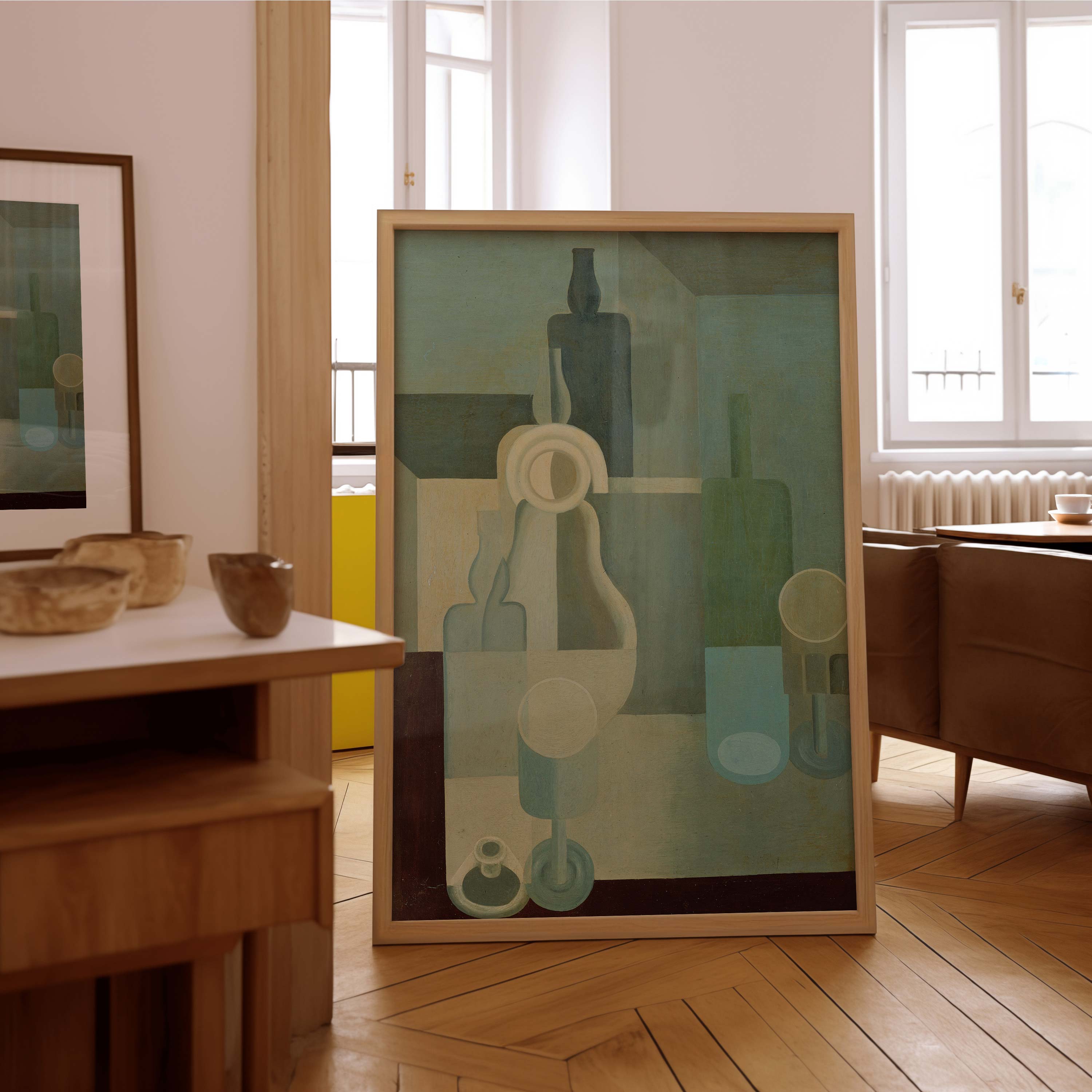
Choose a subject that belongs in your kitchen
Food imagery is an obvious route, but it is not compulsory. Think about whether you want the kitchen to feel sociable, calm, playful or connected to the rest of the house. Choose the image first for that purpose; its connection with the room can come through colour and composition rather than a literal kitchen theme.
STILL LIFE
Warm and familiar
Fruit, vegetables, pottery and botanical studies can connect with cooking without relying on slogans. Painterly detail works well when the surrounding finishes are quiet.
MODERN / ABSTRACT
Keep the shapes clear
A restrained abstract can echo straight cabinet lines or repeat an accent colour. Compare the amount of detail with the backsplash and worktop pattern.
PERSONAL / PLAYFUL
Use humour with intention
Coffee prints, travel memories or a witty food illustration can suit a sociable breakfast area. Check that lettering is readable from the place you normally sit.
In a country-style kitchen with panelled cupboards and timber, a vintage still life or botanical print can feel at home. A contemporary kitchen may suit a graphic fruit illustration or simple abstract shapes. A period house does not require only traditional art: use the frame, colour or repeated shape to connect a modern piece with the architecture. Treat these as useful starting points, not rules that restrict your taste.
If you want quirky kitchen wall art, give one unusual subject room to stand out. Several jokes, colourful appliances and patterned tiles can compete for attention. For a quieter result, repeat one subject across a pair and keep the backgrounds related. Avoid ordering a set solely because the listing labels it “kitchen”: judge the actual images and complete dimensions.
Connect the art with cabinetry, tiles or worktops
Pick one finish you expect to keep. Cabinet colour is often a useful anchor because it occupies a large part of the room; tiles or timber can supply the connection instead. The art does not need to reproduce the exact shade. A small repeated accent can make the relationship clear while leaving the image its own identity.
SAGE · CREAM · OAK
Try warm botanical tones
Soft green foliage with cream and ochre can relate to sage cupboards and wood. Compare the background against your wall so the piece does not visually disappear.
NAVY · WHITE · TERRACOTTA
Add one warm accent
A fruit still life or graphic print with a restrained rust or red accent can give a dark-blue kitchen a warmer note. Keep the other colours limited if the tiles are busy.
WHITE · CHARCOAL · LEMON
Choose a clear contrast
A mostly pale kitchen can carry a dark outline or a fresh yellow accent. Black-and-white photography is another option when bowls, books or plants already bring the colour.
Where the backsplash has a strong pattern, try a simpler image or fewer colours. With plain surfaces, a detailed still life has more room to lead. Compare the artwork in daylight and under the lights you actually use in the evening: a combination that looks balanced on screen may feel different beside warm timber or cool white tiles. Sample prints or physical colour references are more useful than trying to match a screen exactly.
Check the format and care instructions before buying
| Format | Useful comparison | Check before ordering |
|---|---|---|
| Framed paper print | A frame can connect with handles, shelves or timber. | Outer dimensions, glazing, backing, weight and care instructions; a frame is not a waterproof enclosure. |
| Stretched canvas | Fewer surrounding edges can suit a clean, simple wall. | Complete dimensions, surface care and hanging fittings; ordinary canvas is not automatically washable or heat-resistant. |
| Metal or acrylic panel | A different finish may fit a graphic interior. | The actual product specification and fixings; a material name alone does not establish suitability near heat or water. |
The CCI’s guidance on works of art on paper explains that moisture can affect paper’s shape and condition. Protective framing does not remove the need for an appropriate location. Ask the supplier how to clean the specific product; do not use kitchen sprays or a wet cloth on an artwork unless its instructions permit that method.
For installation, check the wall construction, artwork weight and the fixing manufacturer’s instructions. Keep access to switches and cabinets clear and check for services before drilling. A kitchen collection is a styling destination, not a declaration that every listed print tolerates splashes, grease or heat. Where the intended position is doubtful, move the art to the dining side of the room rather than relying on an unverified protective treatment.
Your kitchen wall art buying checklist
- Observe the proposed wall during normal cooking and washing.
- Measure the outer artwork and all gaps in a group.
- Choose one image direction: still life, graphic, abstract or personal.
- Connect with one lasting cabinet, tile or timber colour.
- Test paper outlines from the doorway and your usual seat.
- Confirm care instructions, construction and suitable fixings before ordering.
Browse our kitchen wall art collection once you know the position and usable space. Compare a small shortlist against the same paper outline and colour reference. The aim is a kitchen that feels considered in daily use, with artwork you enjoy looking at and can care for in its chosen position.
Sources: CCI: basic care of paintings; CCI: basic care of works of art on paper. Checked 12 October 2026. Layout measurements are worked examples; palette combinations are styling suggestions.