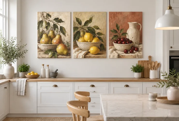

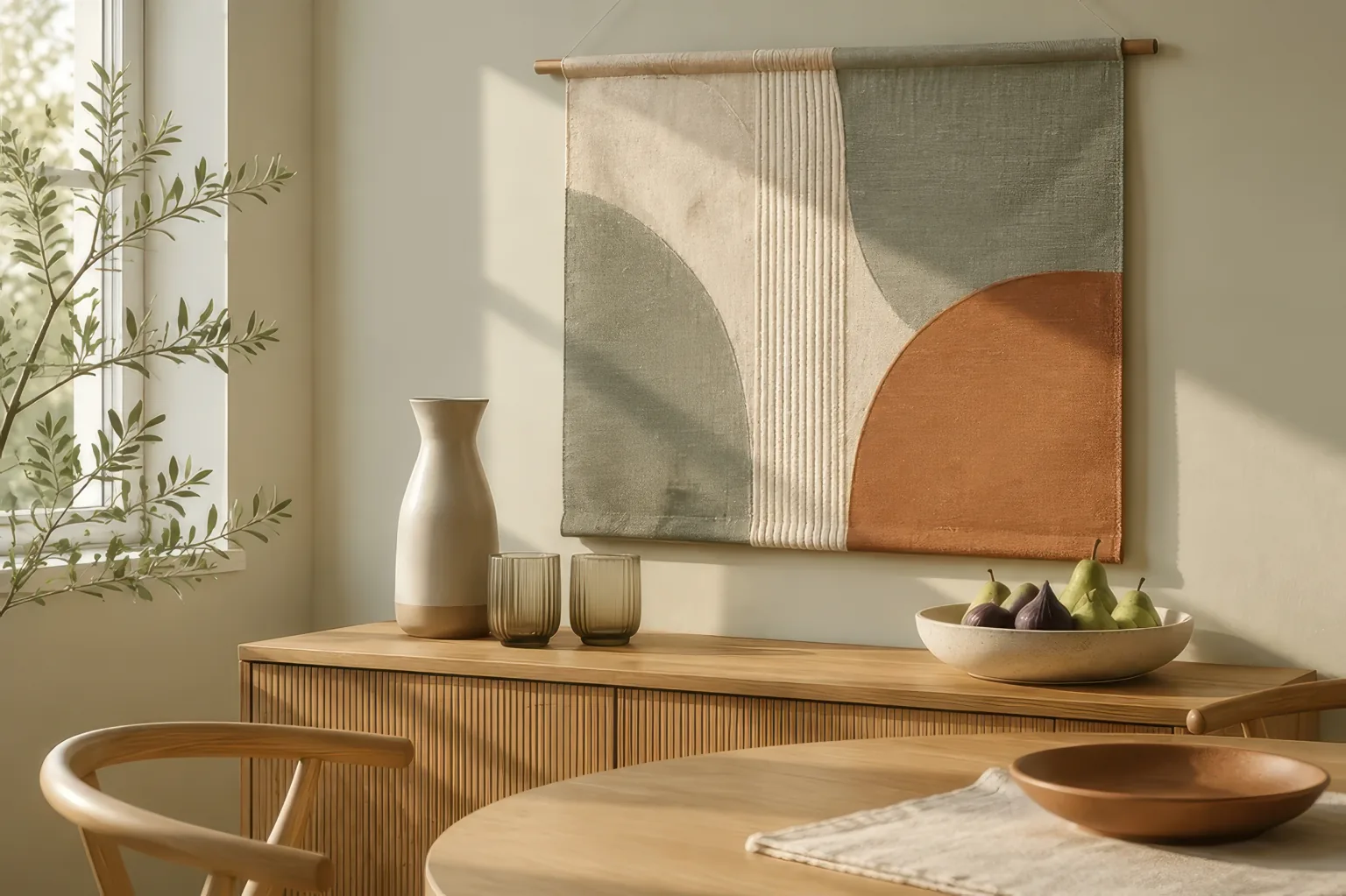
Choose dining-room wall art around the wall people actually see, the furniture beneath it and the view from a dining chair. Compare the complete finished size, including a frame, before deciding on the subject. Still life, landscapes, botanicals and abstract art can all work; the useful choice is the one that connects with your room and remains clear under the lights you use at dinner.
Illustrative room scene for styling inspiration.
YOUR DINING-ROOM ROUTE
- Wall choose the main sightline.
- Scale compare full outer dimensions.
- Subject connect with the room.
- Light test the evening view.
- Check confirm clearance and fixing.
Choose the wall · Compare sizes · Subjects and styles · Light and placement · Buying checklist
Choose the wall from the table, not just the doorway
A dining room has several viewpoints: the entrance, the seats along the table and often a connecting living space. Sit in the chairs you use most and identify the wall that feels worth looking at. A beautiful image hidden behind a pendant or a tall vase may contribute less than a simpler piece on the side wall. Decide which viewpoint matters most before filling every available space.
SIDEBOARD WALL
Make the furniture and art a group
Use the sideboard as a visual anchor. Compare the artwork with the whole arrangement, including lamps and serving bowls. A tall accessory can overlap the image, so test the composition with those objects in place.
WALL BESIDE THE TABLE
Check the seated view
Look from both sides and the ends of the table. The artwork does not have to sit above furniture, but it should feel deliberately placed within its wall area rather than pulled towards an unrelated corner.
OPEN-PLAN DINING
Give the dining area one clear focus
Use one image or a coordinated group to identify the dining zone. Repeat a colour or shape from the chairs or nearby living area without making every wall compete for attention.
In a small dining nook, a narrow vertical piece may suit the clear wall between a window and a corner better than a wide canvas. In a larger room, a single generous piece can provide a simpler focal point than many small pictures. Neither choice is automatically correct: the available wall shape and the furniture you are keeping should lead.
Compare the finished artwork with the clear wall area
Measure the part of the wall you can actually use, excluding switches, wall lights, door swings and architectural features. Then measure the furniture beneath it if there is any. A dining table may project into the room rather than sit against the wall, so do not automatically treat its length as the artwork width. Above a sideboard, the sideboard is usually the more useful reference to compare visually.
| Worked example | Centimetres | Approx. inches |
|---|---|---|
| Sideboard width | 160 cm | 63.0 in |
| One artwork, outer width | 100 cm | 39.4 in |
| Two outer frames plus gap | 45 + 10 + 45 = 100 cm | 17.7 + 3.9 + 17.7 ≈ 39.4 in |
| Side space when centred | (160 − 100) ÷ 2 = 30 cm each | 11.8 in each |
These are trial dimensions, not catalogue sizes or a rule that every dining room must follow. The pair includes the gap in its total span. Inches are rounded independently; calculate with the original centimetres, then convert by dividing by 2.54. A frame or mount can change the outer size, so compare the finished object rather than only the printed image.
Make paper templates of your shortlist’s actual outer sizes and temporarily position them using a method suitable for your wall finish. Compare them from the seats and doorway, with chairs pulled out and accessories in place. If you need the broader sizing process, use our visual guide to choosing art for your home. Here, the important extra check is how the arrangement works during a meal.
Curated for this story
Shop the look
Considered artwork selected to complement the mood, palette and story.
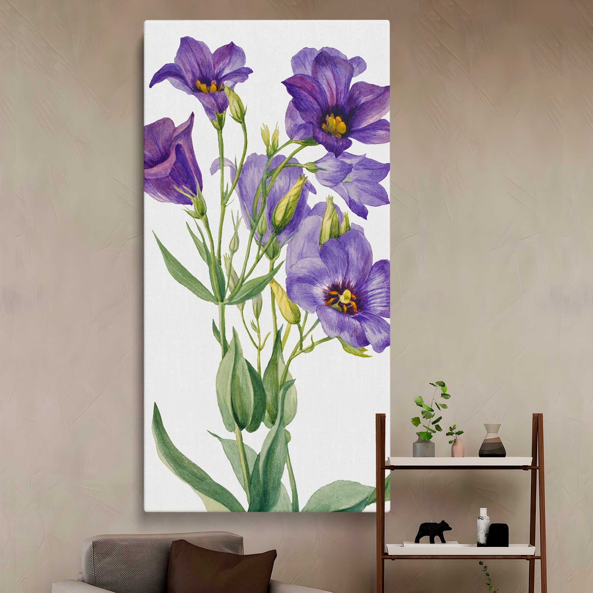
Eustoma russelianum 1930 by Mary Vaux Walcott Canvas Wall Art Print
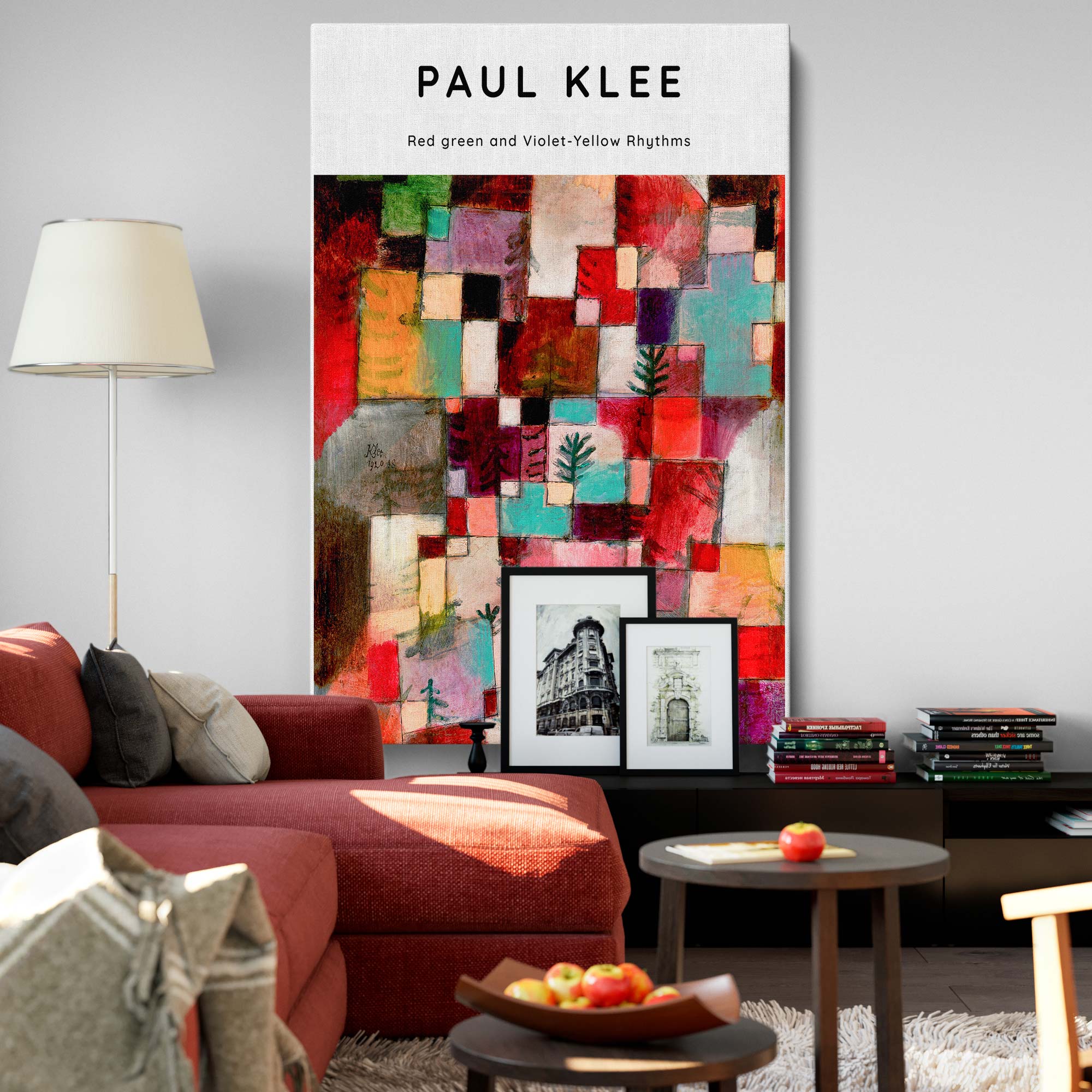
Red, Green, Violet-Yellow Rhythms - Abstract Color Geometry By Paul Klee

Still Life Bottle Painting Print Poster Canvas with Frame or Rolled
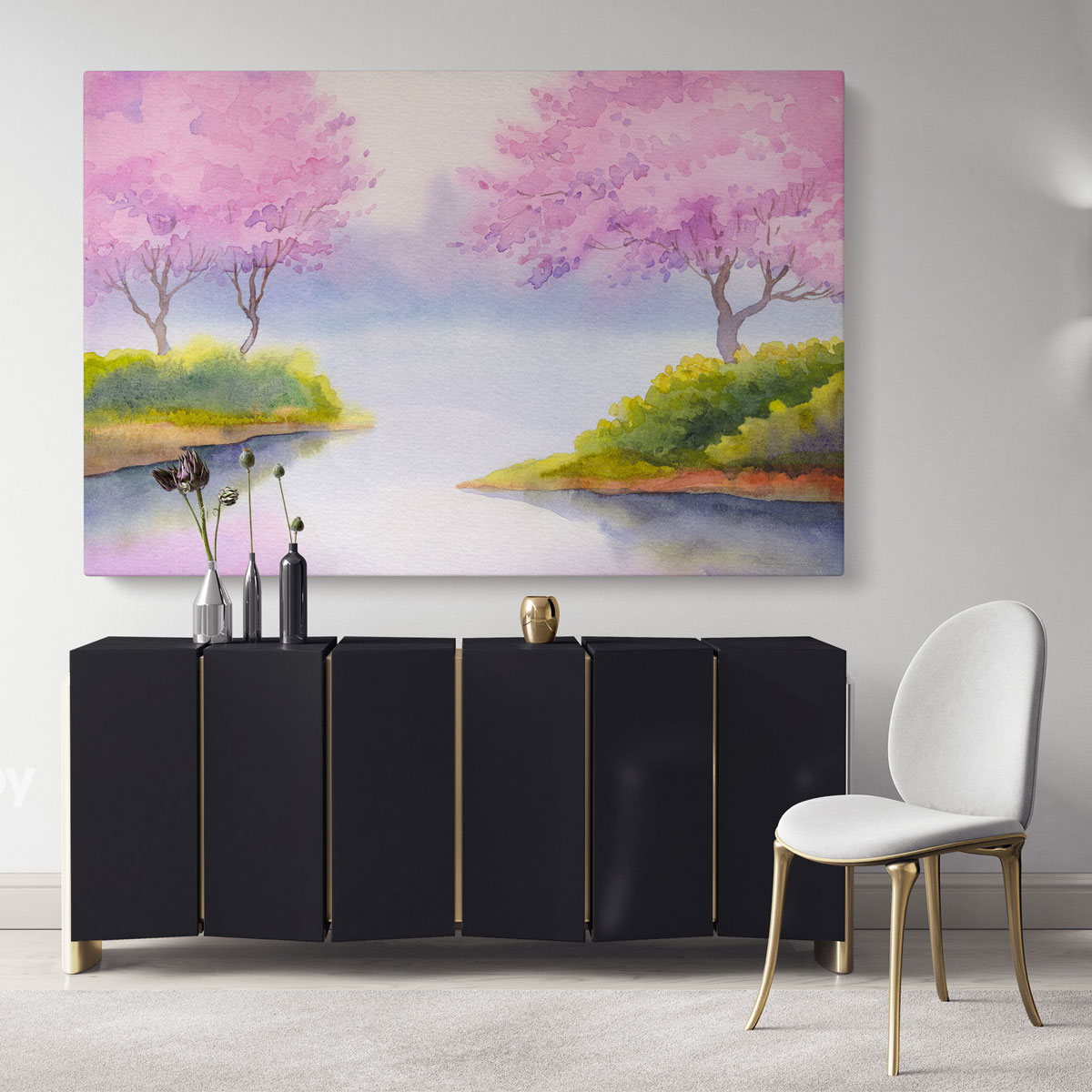
Landscape Spring Watercolour Canvas Wall Art
Choose a subject you want to live with, not a dining-room cliché
Food imagery is an option, not a requirement. Choose something you enjoy seeing repeatedly and compare its level of detail with the table setting, curtains and wallpaper. An intricate picture can be rewarding at close range, while a larger, simpler composition may read more clearly from across the table. You can keep the room formal without choosing a historical scene, or make it relaxed without using a slogan.
| Artwork direction | A useful connection | What to compare |
|---|---|---|
| Still life | Bottles, fruit or ceramics can echo the table and serving objects. | Check whether the colours suit your furniture, rather than choosing only because the subject is food. |
| Landscape | A place you know or a broad horizon can give the room a personal focus. | Look at the image from seated distance; a tiny detailed scene may read differently across the room. |
| Botanical or floral | Leaves and flowers can link timber, textiles and plants. | Compare the image background with your wall and the pattern with your curtains. |
| Abstract | Shapes and colour can connect chairs, rugs and lighting. | Look for a deliberate relationship rather than an exact match to every accessory. |
PERIOD ROOM
Connect one architectural detail
An ornate frame can relate to mouldings, but contemporary art can also work. Try a clear frame edge and one shared colour so the room feels considered rather than restricted to one era.
MODERN ROOM
Compare shape and contrast
A geometric abstract may echo a simple table or pendant. A botanical can also work when its frame or background relates to the room. Choose the connection you prefer, not a compulsory style label.
COTTAGE OR FARMHOUSE
Start with the existing materials
Compare warm timber, woven fabrics and painted furniture with the image’s background. Still life and landscape are useful directions to test, but an understated abstract can sit comfortably alongside these materials too.
For a coordinated pair or three-piece arrangement, compare the pieces as one composition. Shared colours or a consistent frame can connect different subjects. Leave enough visual separation for each picture to be read, and include every gap when checking the overall footprint. A set is not automatically better suited to a long table than one wide image.
Test the pendant, reflections and chair clearance
Check the artwork with the room arranged as you use it. A pendant that looks clear of the picture from the doorway may cross it when you sit down. Glazing may reflect a window or lamp from one chair but not another. Move your paper template or adjust the shortlisted position before committing; there is no single floor-to-centre height that resolves every seated dining view.
AT THE TABLE
Check chairs and people
Pull the chairs out and sit normally. Keep the picture away from likely knocks, leaning shoulders and serving movements. Confirm that the wall position works when the room is occupied.
AFTER DARK
Use your usual dining lights
Look for reflections and parts of the image that become difficult to distinguish. Judge the print reference and frame together; a bright online product image cannot show every lighting condition.
DURING THE DAY
Check sunlight and heat
Consider where direct sun reaches and whether the wall is affected by a radiator or cooking activity nearby. A different position may be more useful than trying to solve everything through framing.
The Canadian Conservation Institute’s guidance for paintings identifies direct sunlight, heat changes and accidental food or drink splashes as display concerns. It is guidance for paintings, not a durability test of our prints. For the format you buy, follow its care instructions and choose a position away from obvious splash or heat exposure; do not assume all canvas or framed prints are washable or fade-proof.
Confirm the format and fixing before ordering
Compare the complete product: image, outer dimensions, edge treatment, frame, glazing if supplied, and weight. Canvas, paper prints and framed formats are not interchangeable specifications. Read the selected product’s actual options and care information. A room mockup illustrates a styling possibility; it does not establish the size, frame or finish you will receive.
Use fixings appropriate to both the wall construction and the finished artwork’s weight. If considering removable strips, check the instructions for that exact product and surface rather than assuming they suit every wall. 3M’s UK picture-hanging guidance, for example, specifies weight limits and preparation requirements and warns against delicate or paper wallpaper. Check local pack instructions for your UK or US product. This guide does not replace fixing instructions.
Once the layout and subject are clear, compare the dining-room wall art collection with your shortlist. Check the product’s live details before ordering. For an open kitchen–dining space, our kitchen wall-art guide covers the additional cooking-area considerations.
Your dining-room artwork checklist
- Choose the wall from both the entrance and your usual dining seats.
- Measure the complete outer artwork and include every gap in a group.
- Compare the artwork with the sideboard or clear wall, not automatically the table length.
- Choose a subject and colour connection you enjoy rather than a required dining theme.
- Test pendant overlap, reflections, pulled-out chairs and serving movements.
- Check the selected format, weight, wall surface and fixing instructions before ordering.
Start with one clear wall and a small shortlist. A paper layout and an evening viewing check can reveal more than adding several accessories to compensate for an uncertain artwork choice. Keep the arrangement that works with your furniture and your everyday view of the room.
Sources: Canadian Conservation Institute: basic care of paintings; 3M UK: picture-hanging instructions. Checked 16 October 2026. Layout examples and diagrams are original planning aids, not universal proportions or tested product claims.