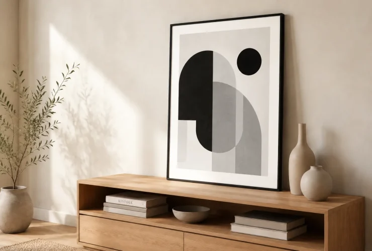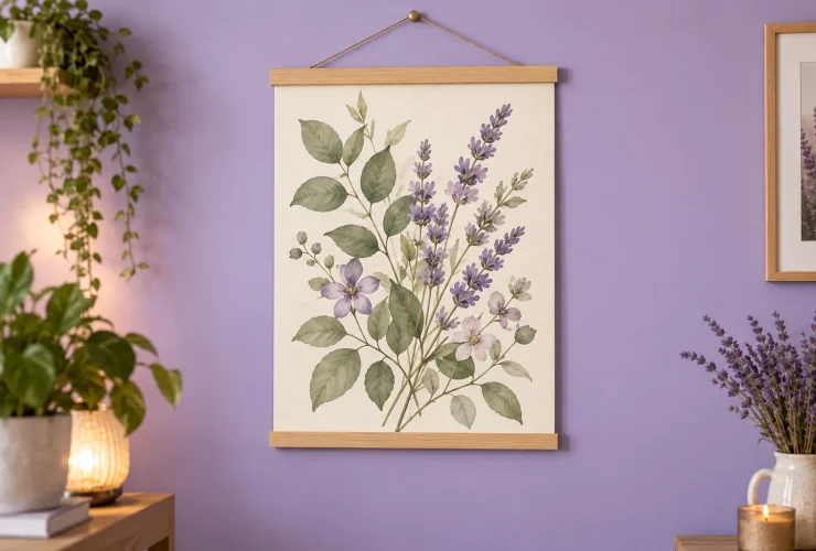

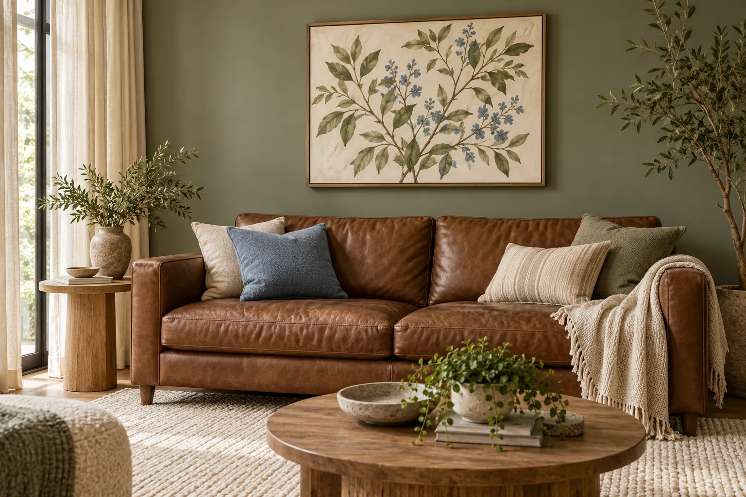
Colours that go with brown include cream, sage green, dusty blue, terracotta, blush pink and plum. The useful combination depends on the brown you already have: a tan leather sofa, chocolate wall and grey-brown floor need different comparisons. Start with the material that stays, choose a supporting colour and use artwork to connect the room.
Illustrative room scene for styling inspiration.
BUILD A PALETTE AROUND WHAT STAYS
- Brown compare the actual material.
- Anchor identify the largest finish you are keeping.
- Partner choose one supporting colour.
- Artwork repeat, bridge or contrast.
- Sample check daylight and your usual lamps.
Identify your brown · Six palettes · Choose artwork · Room examples · Sample checklist
Identify your brown before choosing its partner
Brown is a family of colours, not a single neutral. Put the actual fabric, timber or paint sample beside a cream, a grey and a warmer tan reference. Does it look more orange or red, more grey, or somewhere between them? Also compare its lightness and strength. These are useful observations rather than a laboratory measurement of undertones, and the neighbouring materials can change the impression.
TAN AND CARAMEL
Compare warm and cooler partners
A tan leather sofa may look distinctly orange beside a cool blue and gentler beside cream. Try sage or dusty blue for contrast, then check whether the floor and other timber still belong in the scheme.
CHOCOLATE AND ESPRESSO
Decide how much separation you want
Cream and pale blue give a clearer light–dark difference; plum or dark green can make a deeper composition. With a dark wall, test whether the artwork background and frame remain legible under evening light.
TAUPE AND GREY-BROWN
Keep the neutral comparison visible
Try the brown beside your intended white, pink or green before buying. A grey-brown floor can make a yellowish cream feel different from how it looked on a website. Keep the real floor or fabric in the comparison.
Getty’s elements-of-art guidance distinguishes hue, value and intensity: colour family, lightness or darkness, and colour strength. Those distinctions are more useful than assuming everything labelled brown will match. Farrow & Ball’s brown colour guidance also describes varied brown undertones and recommends sampling with the room’s light and furnishings. The palettes below are our original styling trials, not manufacturer paint matches.
Six brown colour palettes to try with furniture, textiles and art
TAN · SAGE · CREAM
A botanical connection
Keep the tan sofa or chair as the anchor. Try sage on a wall or curtain and cream in a rug or larger textile. A botanical with green leaves and a pale background can connect the three without repeating the leather colour exactly.
CHOCOLATE · DUSTY BLUE · IVORY
Light–dark contrast
Compare a dusty-blue textile or wall with dark brown furniture. Ivory in the curtains or artwork can provide separation. Test the blue beside the actual timber: a stronger blue can make a different statement from this muted example.
WALNUT · TERRACOTTA · LINEN
Related earthy tones
Use the existing walnut table or cabinetry as the stable material. Add terracotta through one smaller fabric or an artwork detail. A linen-coloured wall or curtain can give the warm tones space instead of adding another busy surface.
GREY-BROWN · BLUSH · CHALK
Soft contrast
Try blush in a throw, upholstered chair or small floral detail beside a grey-brown sofa or floor. Compare a chalky neutral wall with the floor before buying. A restrained drawing or floral can support the palette without making every accessory pink.
ESPRESSO · PLUM · PALE STONE
A deeper scheme with relief
Use plum in curtains or a smaller upholstered piece beside espresso furniture. Pale stone in the rug or artwork background can stop the darker shapes merging. Check the full combination in the light used most often, rather than only at midday.
CAMEL · CHARCOAL · WARM WHITE
A more defined outline
Compare camel upholstery with a charcoal accent and warm-white wall. A black-and-white image can repeat the tonal contrast; a timber frame can link to the furniture. Test the white and the frame together so the contrast feels intentional.
Swatches are approximate screen colours, not product codes. The first colour is an anchor, not a required percentage of the room. Compare physical paint, fabric, timber and leather samples together. You can use the same colour family in different strengths without matching every surface exactly.
| If the brown is… | Try a supporting change | Artwork comparison |
|---|---|---|
| A large leather sofa | A rug, curtain or wall sample that suits both leather and floor | Compare a pale background with one blue or green detail. |
| A dark painted wall | A lighter textile or an existing natural finish | Check the frame edge and image contrast in evening light. |
| The floor and timber furniture | One quieter wall colour rather than several new woods | Repeat a timber tone in a frame, or compare a deliberate dark edge. |
| Only a small accent | Keep the existing larger surfaces as the main reference | Let a small brown mark in the art connect with the accent. |
Curated for this story
Shop the look
Considered artwork selected to complement the mood, palette and story.
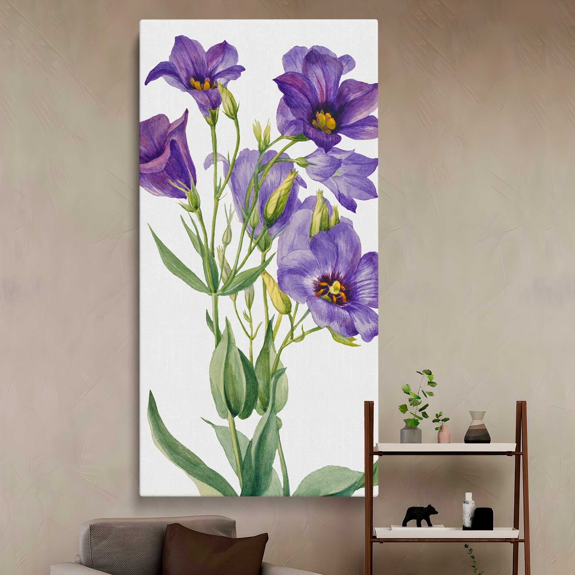
Eustoma russelianum 1930 by Mary Vaux Walcott Canvas Wall Art Print
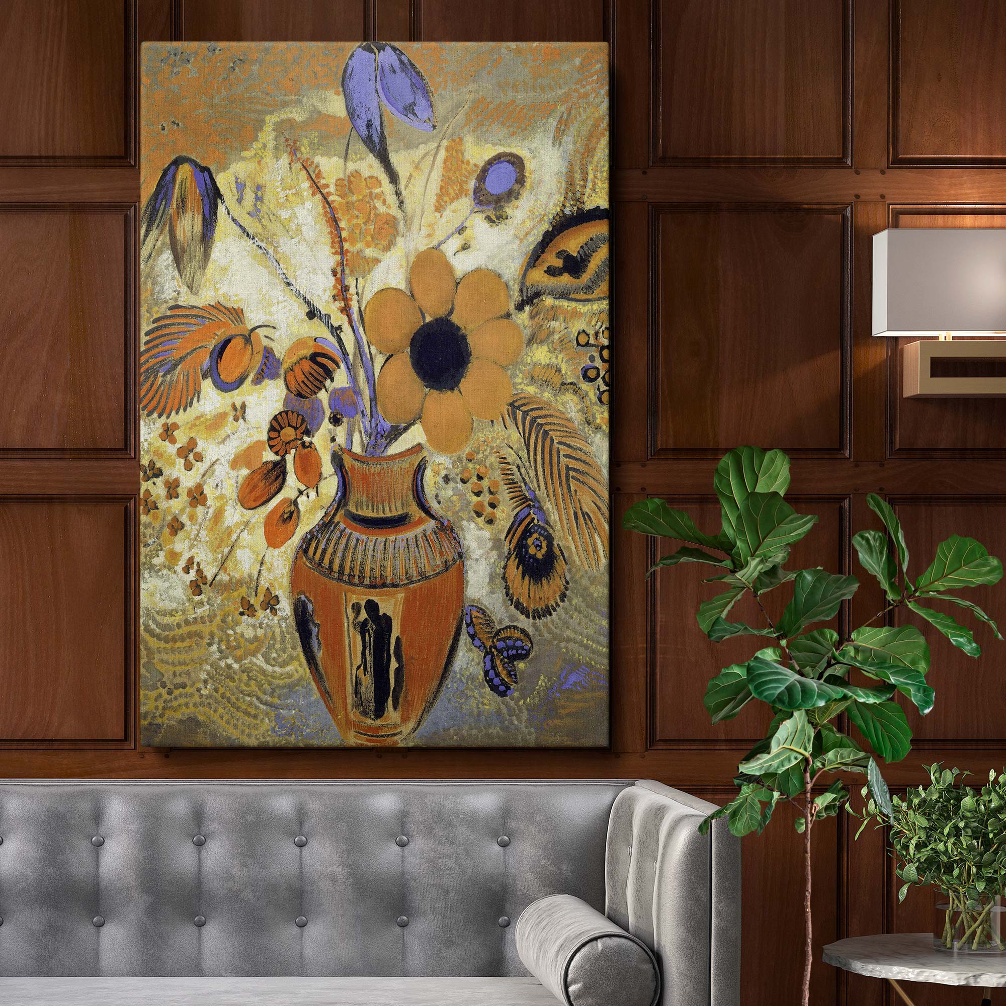
Etruscan Vase with Flowers - Symbolic Floral Still Life By Odilon Redon
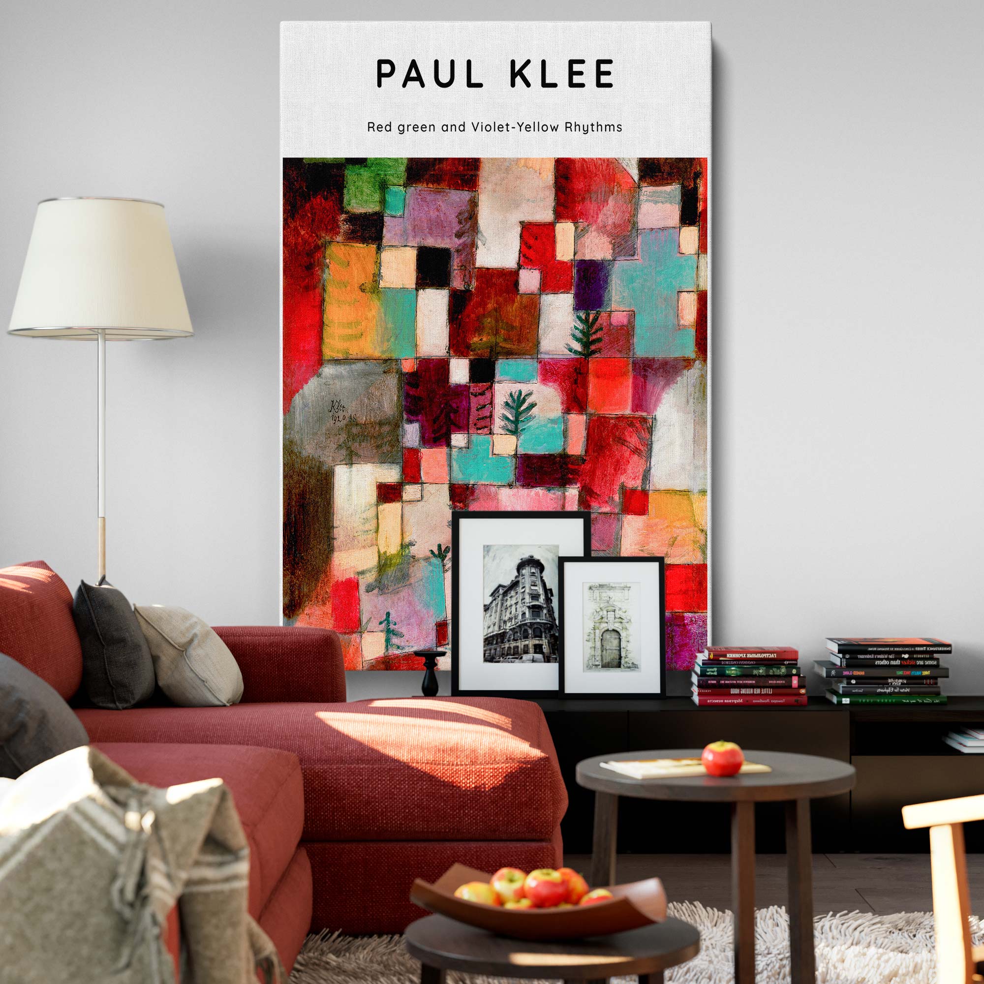
Red, Green, Violet-Yellow Rhythms - Abstract Color Geometry By Paul Klee
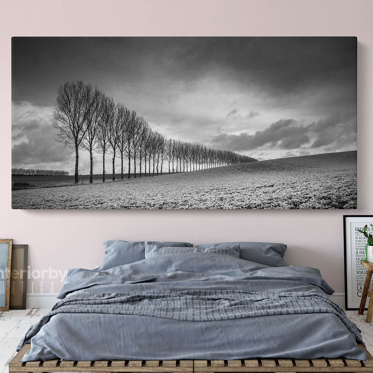
Panoramic Black and White Photography Canvas Wall Art
Use artwork to repeat, bridge or contrast with the brown
Look at the complete picture, including its background, subject and frame. Brown furniture does not require a mainly brown artwork. A small ochre or earthy detail can connect with warm timber, while a pale botanical background can separate the image from a dark wall. Compare the relationship you want rather than trying to find a print that contains every colour in the room.
REPEAT
Echo one existing detail
Pick up a timber tone, a cushion colour or a repeated shape. The artwork can still have a different main colour. A connection in one small area is often enough to test before adding more matching accessories.
BRIDGE
Connect two materials
Try an image with a warm earthy mark and a green, blue or plum detail already present in the textiles. Compare the actual image colours; a title such as autumn or vintage does not establish a palette match.
CONTRAST
Keep the image distinct
With a chocolate wall or espresso furniture, compare a lighter image background or a clearer frame edge. A dark artwork can work too; check whether its shapes remain visible from your usual seat.
A floral can link brown furniture with a plum or blush accent. An abstract can introduce a stronger colour in a controlled part of the room. A monochrome photograph can relate to dark fittings without adding another hue. The curated examples show different directions rather than exact matches to the cover scene. Check each product’s actual format, frame options and finished dimensions before ordering.
For the wider room, scale and buying process, use our guide to choosing art for your home. If you prefer tonal separation to another colour, our black-and-white wall art guide explains contrast and framing in more detail.
Adapt the palette to the room and what you are keeping
| Room example | Keep this in the comparison | A palette trial |
|---|---|---|
| Living room | Sofa, rug, flooring and curtains | Tan leather, sage and cream, with a pale botanical or an earthy detail in the art. |
| Bedroom | Headboard, wardrobe timber and bedding | Grey-brown, blush and chalk, with a restrained floral or drawing. Compare from bed as well as the doorway. |
| Dining room | Table, chair upholstery and evening light | Walnut, terracotta and linen, with a still life or landscape that links one warm tone. |
| Home office | Desk, shelving and the wall you see most | Chocolate, dusty blue and ivory, with a clear image that remains distinct beside storage. |
In a period home, existing joinery and timber can anchor the scheme without requiring every frame or table to match. Contemporary art can still connect through colour or shape. In a modern flat, brown leather or timber can sit beside a cleaner pale background and a simple frame. Treat the house style as a source of clues; the materials actually in the room should guide the final comparison.
If the walls need to stay neutral, start with one textile or artwork change. Keep the sofa or floor as your reference and compare two possible supporting colours against it. If you want a deeper brown wall, develop the whole sample group first, including the image background and the lighting you plan to use. Avoid buying several new finishes to compensate for one uncertain pairing.
For a seating-led room, our living-room wall art guide covers the views from the sofa and armchair. Choose the palette here, then use that room-specific guide to assess the display position.
Test light, texture and the neutral beside the brown
Sample the supporting colour alongside the actual brown material, not on the other side of a shop or screen. Farrow & Ball recommends checking brown samples with your light and furnishings. Compare in daylight and under the lamps you normally use. The aim is to decide whether you like the combination in its intended setting; a colour name or an online swatch cannot settle that for every room.
DAYLIGHT
Keep the sample group together
Put wall, fabric and artwork references beside the floor or furniture. Compare more than one part of the room. A pale neutral that works on its own may look different beside a red-brown timber.
EVENING
Use the usual room lighting
Check the lamps you actually switch on. Look for separation between the brown furniture, the wall and the artwork. Decide whether a lighter background or a different supporting sample would help.
TEXTURE
Compare real finishes
Leather, velvet, linen, varnished timber and paint do not present colour in the same way. Include texture and sheen in the trial; a flat screen swatch cannot show every material effect.
| What feels wrong? | A smaller change to test |
|---|---|
| Several browns feel disconnected | Compare their colour direction and repeat one existing tone in a frame or textile. Do not add another timber immediately. |
| Brown and grey look flat together | Try a clearer light–dark difference, a different grey sample or a small green/blue accent. |
| The art disappears on a dark wall | Compare a pale image background or a more distinct frame edge. |
| Everything looks too closely matched | Keep one brown anchor and vary texture or add a deliberate supporting colour. |
Your brown room-palette checklist
- Identify the actual brown material and the largest finish that stays.
- Compare colour direction, lightness and strength rather than names alone.
- Choose one supporting colour and a neutral to test together.
- Use artwork to repeat a detail, bridge finishes or create contrast.
- Check real materials in daylight and under your usual lamps.
- Confirm the selected artwork’s format and finished size before ordering.
Start with one brown you want to keep and a small group of samples. A coherent room does not need identical browns everywhere; it needs relationships you can see and enjoy in the room’s everyday light.
Sources: Getty: understanding formal analysis; Farrow & Ball: brown colour schemes. Checked 26 October 2026. Palette names, room combinations and diagrams are original styling examples. Swatches are approximate screen colours, not manufacturer codes or measured undertones.