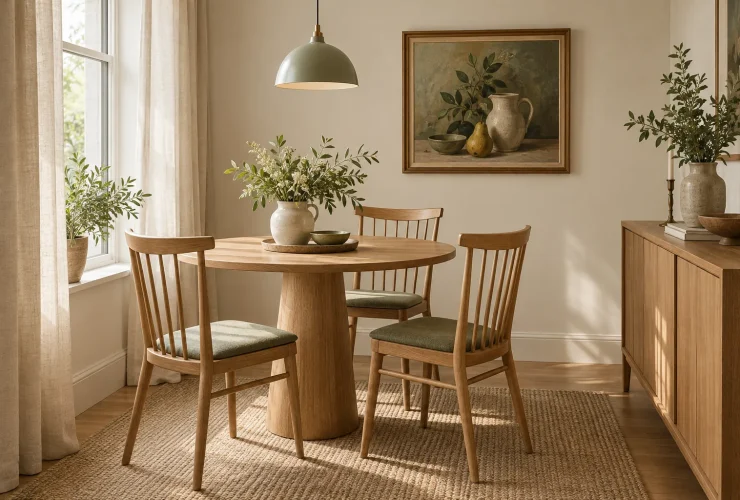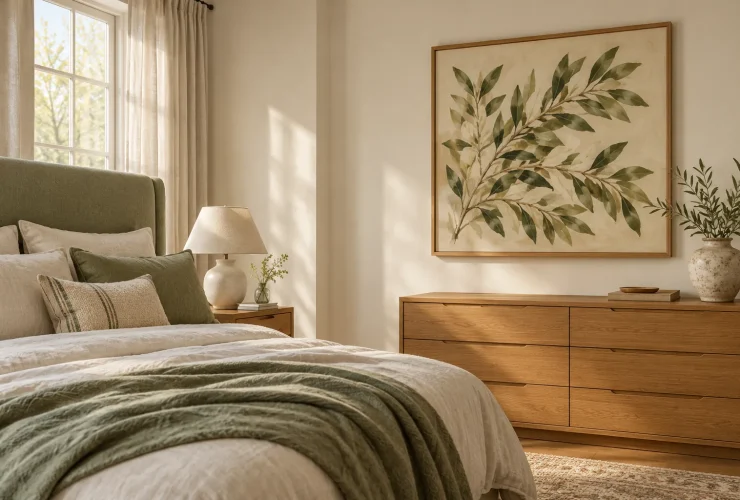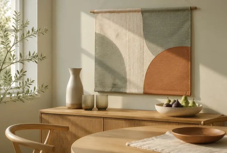

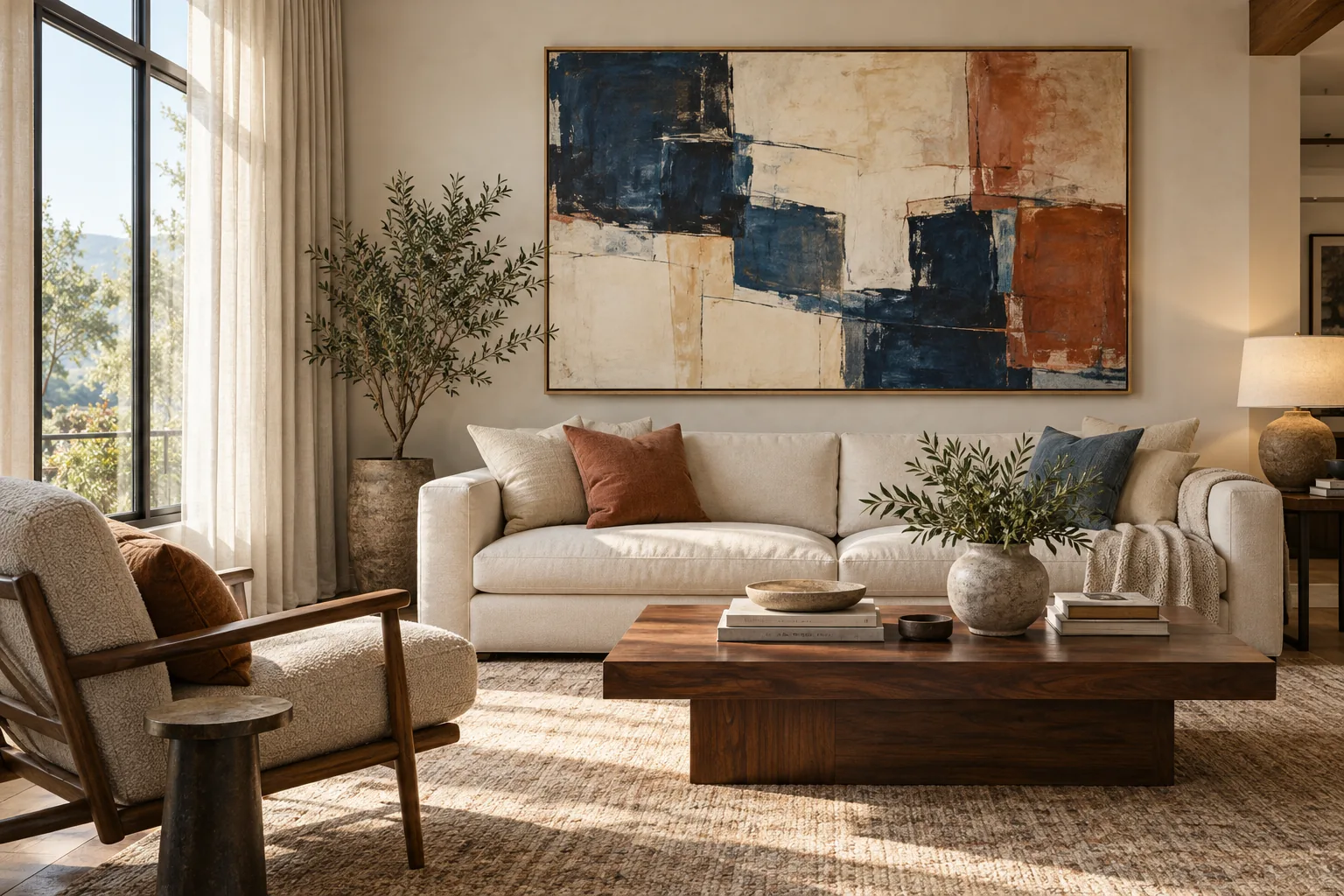
Choose living-room wall art by identifying the main view, comparing the complete finished size with your furniture and deciding how the image should relate to the room. Above the sofa is a useful starting point, but a wall visible from the seating may be more rewarding. Compare subject, colour, frame and reflections before choosing a single statement piece or a coordinated group.
Illustrative room scene for styling inspiration.
YOUR LIVING-ROOM ART ROUTE
- View compare the entrance and the seats.
- Scale test the complete outer arrangement.
- Subject choose a connection you enjoy.
- Light check the daytime and evening view.
- Confirm read the selected format and fixing details.
Choose the view · Compare sizes · Subjects and colour · Placement checks · Buying checklist
Choose a focal wall from the seats as well as the entrance
Walk into the room, then sit in your usual seat and any armchair used regularly. A picture behind the sofa may welcome you from the doorway while staying out of sight when you sit down. A side wall can offer a better everyday view. Decide whether the artwork should complete the entrance composition, contribute to the conversation area or give you something to enjoy opposite the sofa. One arrangement can serve more than one purpose, but it does not have to serve every viewpoint.
SOFA WALL
Compose with the whole seating group
Compare the sofa, side tables, lamps and art together. An off-centre sofa can still have an intentional arrangement; identify whether the artwork belongs with the furniture or with an architectural feature before deciding where to centre it.
SIDE WALL
Give seated viewers a useful view
Look from both ends of the sofa and the armchair. Check door swings, tall plants and reading lamps. A slightly smaller image in a clear sightline may contribute more than a larger one interrupted by everyday objects.
TV OR FIREPLACE WALL
Avoid competing centres of attention
A screen or fireplace may already dominate the room. Consider giving the artwork another wall, or use a restrained supporting arrangement. Above an active fireplace also needs a separate heat and care assessment, rather than a styling decision alone.
Compare one large picture with the span of a group
Measure the actual outside width of the sofa or sideboard beneath the proposed art, plus the clear wall above it. Exclude wall lights, switches and architectural interruptions. Record the artwork’s finished outer dimensions, including its frame or mount where supplied. A product labelled large or extra large can still be the wrong shape for your wall: the numbers and the surrounding space are more useful than the label.
| Worked example | Centimetres | Approx. inches |
|---|---|---|
| Sofa outside width | 240 cm | 94.5 in |
| One artwork, outer width | 144 cm | 56.7 in |
| Two frames and one gap | 66 + 12 + 66 = 144 cm | 26.0 + 4.7 + 26.0 ≈ 56.7 in |
| Three frames and two gaps | 40 + 12 + 40 + 12 + 40 = 144 cm | 15.7 + 4.7 + 15.7 + 4.7 + 15.7 ≈ 56.7 in |
These dimensions are a trial comparison, not product options or a recommended ratio. The gaps are part of the overall width. Inches are rounded independently; calculate with the centimetres first, then divide by 2.54. Two arrangements of equal width can still feel very different because of their height, image density and framing. A tall narrow picture can suit a wall pier even when a wider one would suit the sofa wall.
Make paper templates of your shortlist’s actual outer sizes and temporarily position them using a method suitable for your wall finish. Compare them from the seats and doorway, with lamps and plants in place. For the broader measurement process, see our visual guide to choosing art for your home. The living-room decision here is which arrangement stays coherent across several everyday views.
Curated for this story
Shop the look
Considered artwork selected to complement the mood, palette and story.
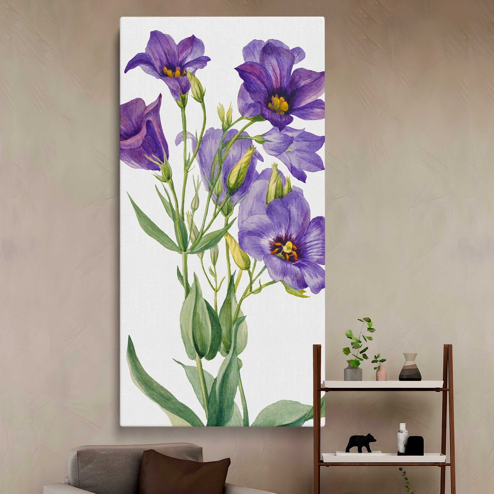
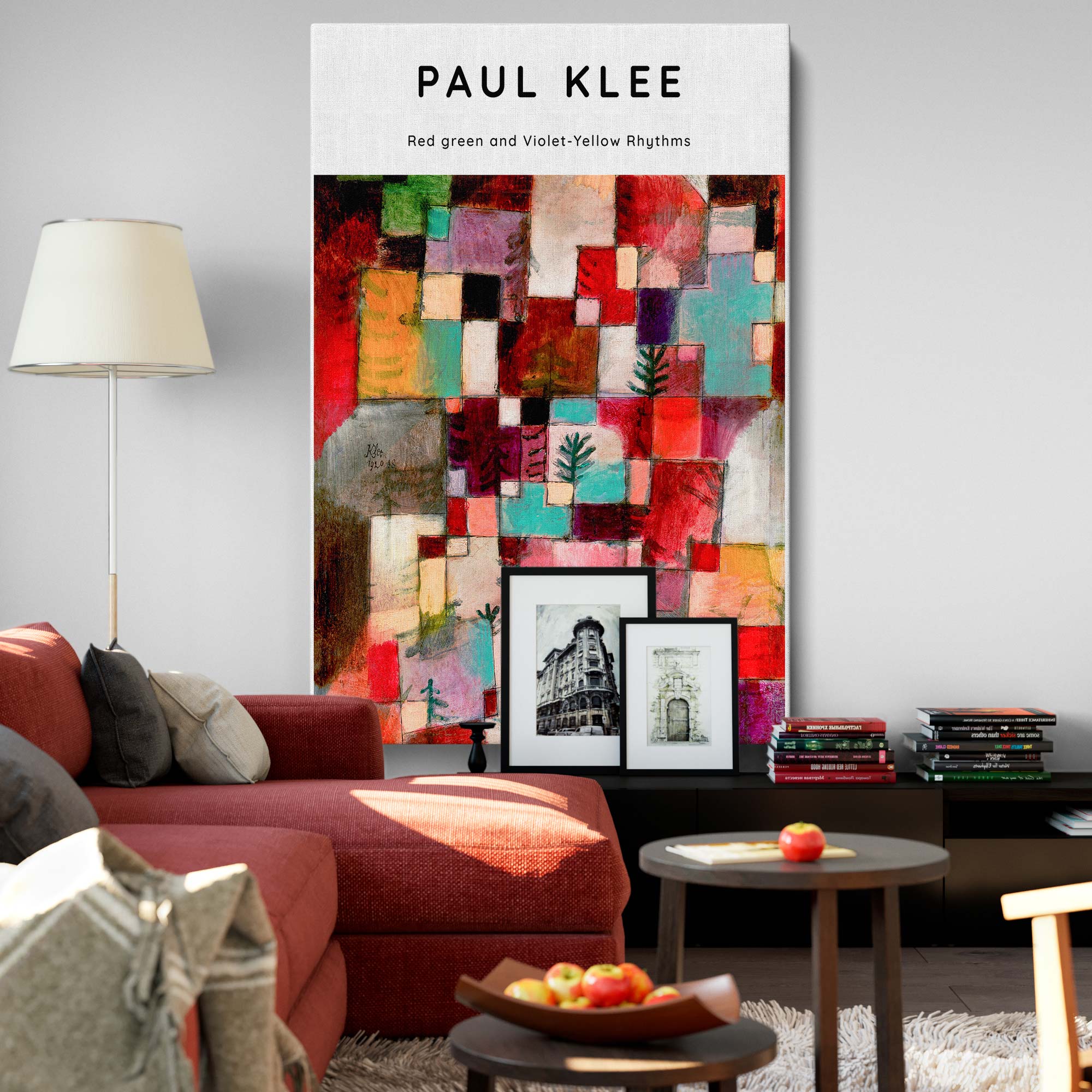
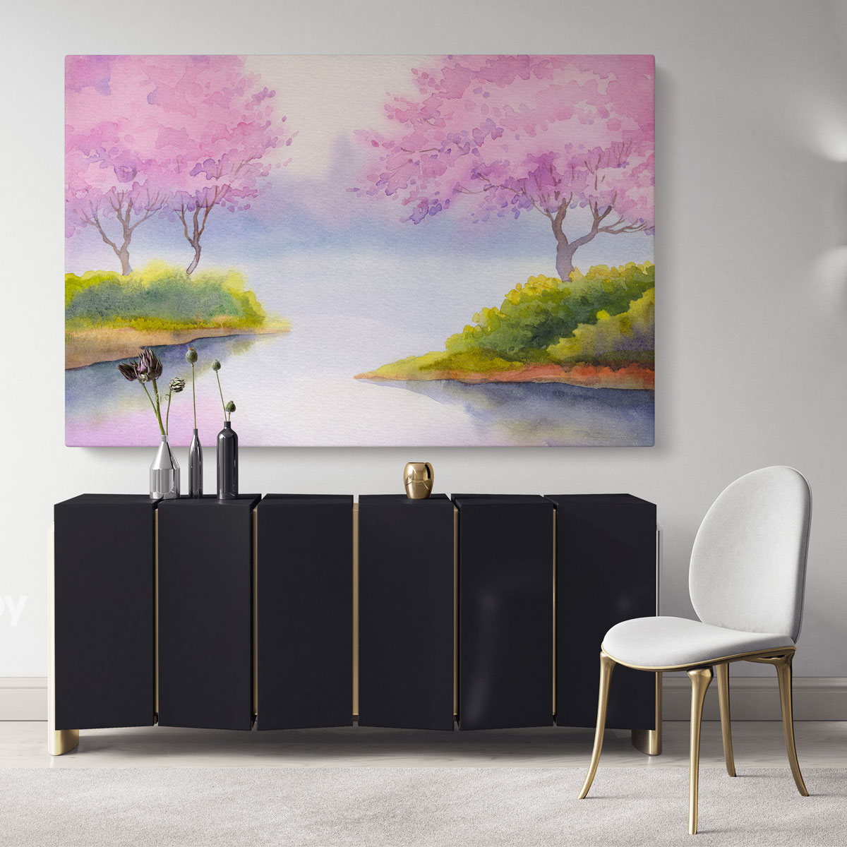
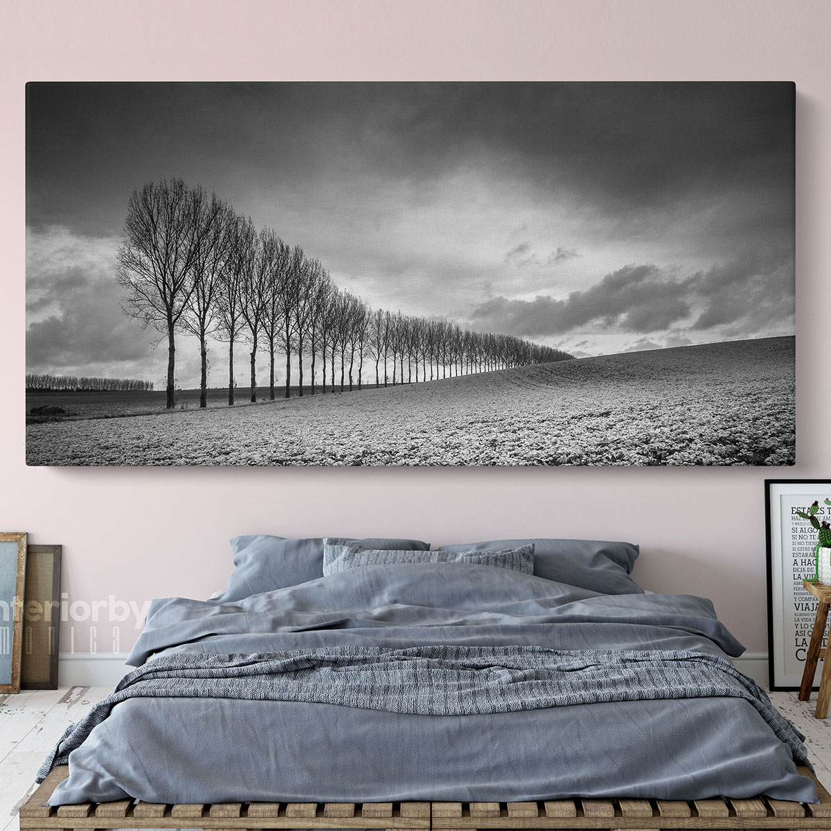
Choose a subject and colour relationship, not a matching formula
A landscape can connect with a meaningful place; a botanical with shapes in textiles or plants; an abstract with colour and movement; a photograph with a subject you enjoy. Start with that reason for choosing the image. Then compare it against the sofa, rug, curtains and wall. The picture does not need to contain every room colour, and a neutral sofa does not require neutral art.
| Artwork direction | A useful room connection | A comparison to make |
|---|---|---|
| Landscape | A remembered place, a broad horizon or colours in the rug. | Does the main scene remain clear from your usual seat? |
| Botanical or floral | Organic shapes, timber and one repeated textile colour. | Does its detail add interest or compete with patterned curtains? |
| Abstract | A repeated curve, a colour accent or a deliberately different rhythm. | Does the level of contrast support the focal point you want? |
| Black-and-white photography | A subject you enjoy and a tonal link with darker furniture or fittings. | Compare the light–dark structure with the wall and nearby screen. |
Getty’s guide to the elements of art distinguishes hue, value and intensity: colour family, lightness or darkness, and colour strength. Those distinctions provide a useful way to compare two images that are both described as blue, for example. One may be pale and muted; the other dark with sharp contrasts. The following room choices are styling examples, rather than rules supplied by Getty.
REPEAT A DETAIL
Use a small existing connection
Try a colour from the rug or curtain in the artwork without matching its exact shade. A repeated curve or natural shape can connect the pieces just as effectively as a repeated colour.
ADD CONTRAST
Give a quiet room one clear focus
With plain upholstery, compare a stronger composition against a restrained one. Keep the rest of the proposed arrangement simple while judging whether that contrast is the focus you want.
EDIT A BUSY ROOM
Compare detail as well as colour
Patterned rugs, curtains and shelves can already carry a lot of information. Try a picture with a broader composition or more open space before assuming you need a completely different palette.
House-style labels can help narrow a shortlist, but use the actual room as the reference. In a period living room, mouldings and timber may relate to a traditional frame while a contemporary image adds contrast. In a modern room, a simple outline may echo clean furniture lines without limiting you to abstract art. For an open-plan space, repeat one material or colour between areas and allow each zone its own emphasis. You do not need identical artwork sets across the room.
If a monochrome approach appeals, our black-and-white wall art guide develops the contrast and framing choices. Keep this guide’s room-level questions in mind while comparing those subjects.
Test reflections, heat and everyday movement before fixing the position
Look at the proposed wall in daylight and under the lamps you use in the evening. Check reflections from the sofa and armchair if the chosen format has glazing or a reflective finish. The brightest wall is not automatically the best display wall. A picture beside a window may receive direct sun at a different time of day, while a reading lamp may obscure the view or create a reflected bright patch.
The Canadian Conservation Institute’s painting-care guidance discusses light exposure, local heat and physical damage when choosing a display position. It specifically describes the heat and environmental changes around a working fireplace as a concern. That source addresses paintings, not tested durability of printed canvas. Avoid obvious sunlight and heat hotspots, and check the care guidance for the exact product you select. A mockup above a fireplace does not establish that the location suits the product.
Check that doors, curtains and everyday movement will not strike the finished artwork. Compare the wall with lamps in their normal positions and chairs pulled out. Use fixing hardware suited to the wall construction and the complete framed or unframed artwork weight, following the exact manufacturer’s instructions. If the wall or load is uncertain, obtain appropriate installation advice before hanging. Do not infer fixing methods or installation heights from a styled room scene.
Confirm the format and shortlist the actual products
Compare the full product rather than only the image: outer width and height, canvas edge or paper format, frame and mount if included, glazing if supplied, weight and care requirements. A set of three can offer a repeated rhythm but introduces more gaps and positions to plan. One large work can be visually simpler but needs a suitable clear area. Neither format is automatically better for a small or large room.
Browse the living-room wall art collection with a small list of subjects and finished sizes to compare. Read each shortlisted product’s live options before ordering; the original diagrams here use planning dimensions rather than catalogue sizes. Keep your furniture layout settled long enough to judge the art in its intended position.
Your living-room artwork buying checklist
- Choose the main view from the entrance, sofa and armchair.
- Measure finished outer artwork dimensions and every gap in a group.
- Compare one large piece, a pair or a set with the same clear wall.
- Choose a subject and one deliberate relationship with the room.
- Test the evening view, reflections, direct sun, heat and furniture movement.
- Check the live product format, full weight, care and exact fixing instructions.
A considered living-room arrangement should work with the way you sit, move and look around the room. Start with the view, test the complete shape on the wall and keep the subject you enjoy seeing. The best shortlist is one you can compare in your actual room, rather than only in a styled photograph.
Sources: Getty: understanding formal analysis; Canadian Conservation Institute: basic care of paintings. Checked 23 October 2026. Room comparisons and diagrams are original styling examples. Dimensions are planning aids, not catalogue specifications or universal proportions.