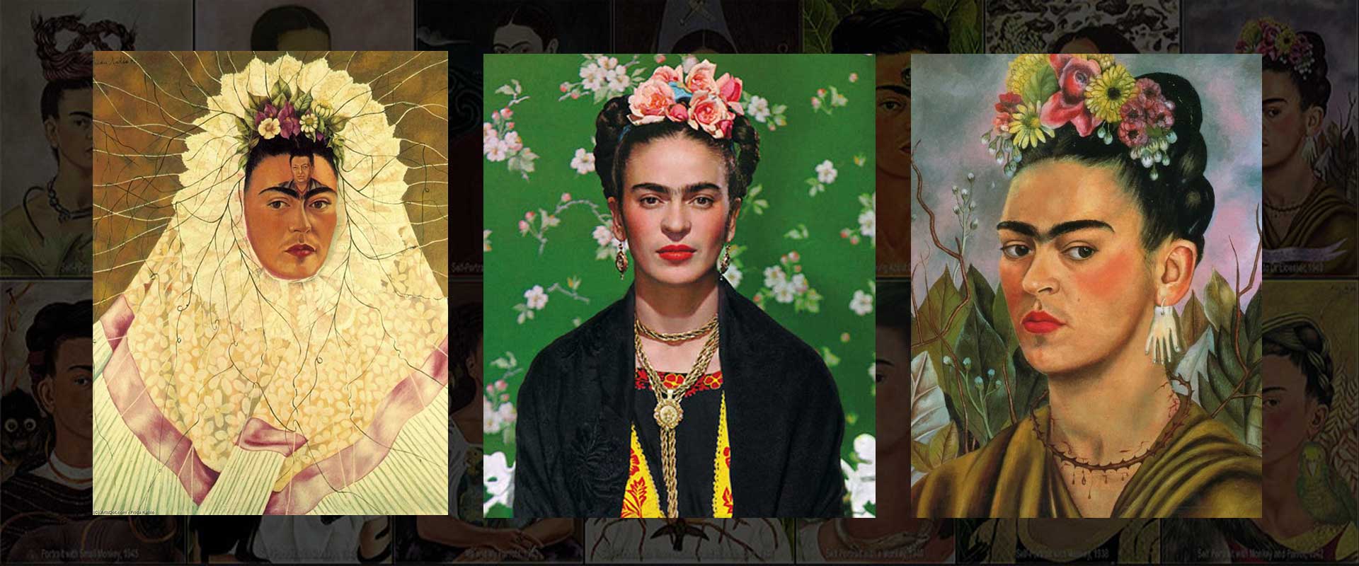
Frida Kahlo’s paintings are not only known for their striking imagery and deeply personal symbolism but also for the way she used color to amplify emotional impact and celebrate her cultural identity. For Kahlo, color was never a mere decorative choice; it was a deliberate emotional language. Each hue she applied to her canvas carried meaning, drawn from personal experiences, Mexican folk traditions, and the events shaping her life. Her mastery of color allowed her to communicate in ways words could not, turning each painting into an emotional and cultural statement. Her approach to color can be better understood when viewed alongside the visual storytelling explored in Frida Kahlo and Symbolism: Decoding Her Visual Language.
The Emotional Power of Kahlo’s Palette
Kahlo often chose colors to reflect her physical pain, emotional state, or political ideals. She used vibrant contrasts to heighten tension and visual drama, while subtle shifts in tone could create an atmosphere of melancholy or serenity. Color for her was an extension of emotion—it could soothe, confront, or unsettle the viewer.
Key emotional uses of color in her work included:
- Red to convey passion, vitality, blood, and sacrifice
- Blue to represent calmness, spirituality, or sadness
- Green to symbolize growth, fertility, and hope
- White for purity and innocence, often contrasted with darker or more violent imagery
Common Colors in Kahlo’s Work and Their Meanings
| Color | Emotional Meaning | Cultural/Political Significance | Example Work |
|---|---|---|---|
| Red | Passion, pain, life force | Bloodlines, revolutionary struggle | The Two Fridas |
| Blue | Tranquility, spirituality, sorrow | The Virgin Mary’s robes in Catholic art | Self-Portrait with Cropped Hair |
| Green | Fertility, renewal, hope | Nature, indigenous heritage | Roots |
| White | Innocence, vulnerability | Purity in Catholic symbolism | The Two Fridas |
| Yellow | Energy, creativity, warmth | Sunlight, indigenous symbolism of maize | Portrait of Luther Burbank |
Cultural Influence on Color Choices
Kahlo’s palette was deeply rooted in Mexican cultural traditions, particularly those of indigenous and folk art. Bright, saturated tones echoed the textiles, embroidery, and decorative crafts of Mexico, while certain combinations of colors referenced specific cultural motifs. Her Tehuana dresses, often painted in vibrant reds, greens, and whites, mirrored the colors of the Mexican flag, subtly expressing her political pride.
These cultural influences also drew from festivals such as the Day of the Dead, where marigold orange and deep purple create a visual vocabulary tied to both life and death. By weaving these traditions into her work, Kahlo transformed her self-portraits into cultural artifacts as much as personal expressions. You can explore this further through the vibrant collection of Frida Kahlo Wall Art Prints that reflect her bold palette.
Color as a Symbol of Pain and Healing
Kahlo’s chronic health struggles and emotional turmoil were central to her art, and her colors reflected those experiences. Deep reds often suggested physical suffering, as in the visible arteries of The Two Fridas. Cool blues could indicate emotional isolation, as in The Broken Column, where the muted background mirrors her solitude.
In contrast, paintings created during happier periods often burst with warm yellows, lush greens, and flower-filled settings, reflecting moments of vitality and connection to nature.
How Kahlo Balanced Contrasts
One of Kahlo’s signature techniques was her ability to balance intense contrasts. She frequently placed vibrant foreground elements against muted or stormy backgrounds, creating a push-and-pull between life and death, joy and pain. This duality is most visible in The Two Fridas, where a pristine white dress is stained with blood, and a calm blue-gray sky hovers over an emotionally charged scene.
This interplay of colors was not just aesthetic but conceptual, reinforcing the contradictions that defined her life and work.
Reading Kahlo’s Colors: Tips for Viewers
When analyzing a Kahlo painting, you can better appreciate her intent by:
- Noting dominant colors and how they relate to the painting’s subject matter
- Observing color placement—foreground vs. background
- Considering cultural and historical context for the chosen palette
- Identifying contrasts between “emotional” colors and “cultural” colors
Conclusion
Frida Kahlo’s use of color was an intentional and multi-layered form of expression, bridging the personal, cultural, and political. Her colors could tell stories of love and suffering, celebrate her Mexican heritage, and evoke deep emotional responses from viewers. By decoding her palette, we gain access to another dimension of her artistry—one where every brushstroke of color carries the weight of her life experiences and the richness of her cultural roots. Understanding her color choices is essential for truly appreciating the depth of her work and the emotional resonance it continues to hold.


